
Kindred Stamps March Release: Tune In
Tune In for these amazing cards utilizing the Tune In stamp set from Kindred Stamps.
As a kid, you couldn’t wait to watch your cartoons. Be it after school, or Saturday morning. You would tune in onto one of the 5 channels you got on the farmer antenna and just stare at the tv for hours engrossed in the spectacles in front of you. When I saw the Tune In stamp set in the Kindred Release, I knew I needed this set!! Let me take you back to your childhood with these cards that harness the magic of times gone by and the age of innocence… and spy’s…
This blog utilizes affiliate links for the products that I utilized. By clicking on the links, you are supporting me without any cost to you. I thank you for your support if you choose to utilize the links provided. Let’s Tune In…

Tune In, Kindred Stamps
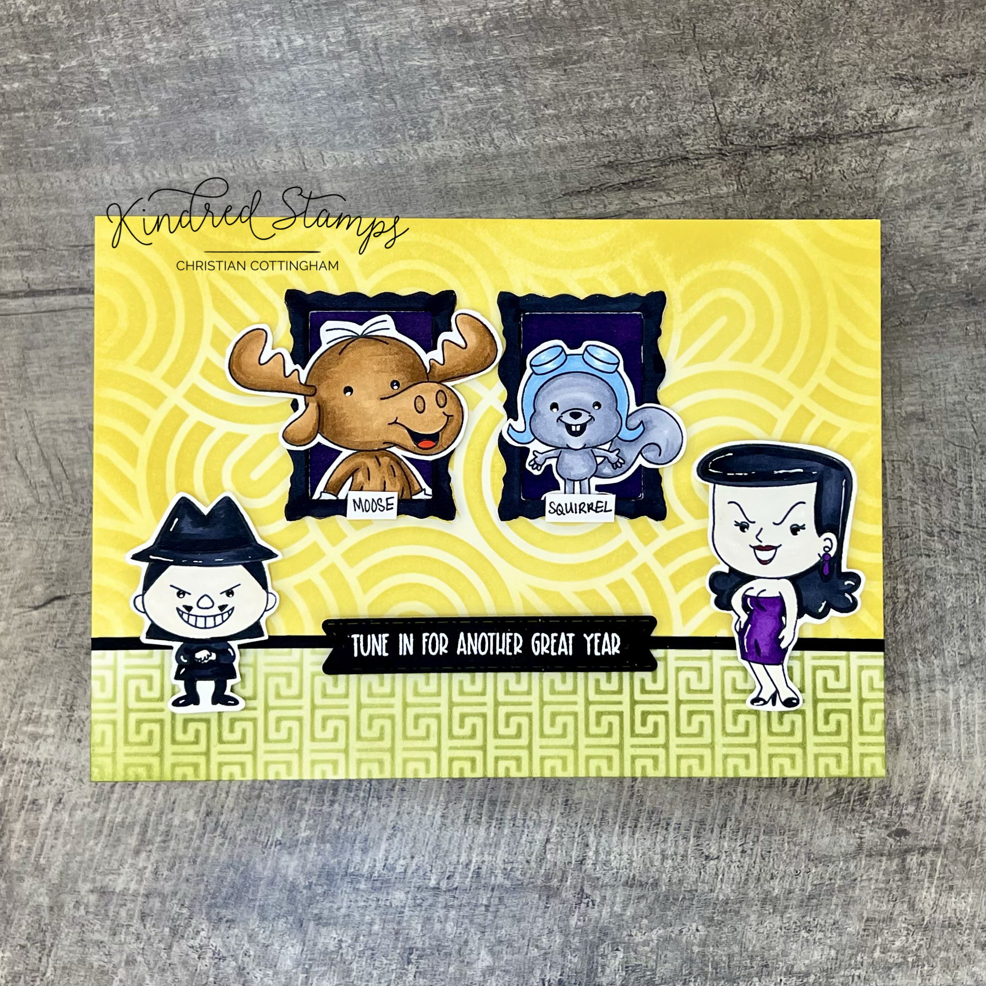
Project One: Magician Wanna Be
Watch me…. Make some magic with the Tune In set! This wanna be magician and his assistant want to let the recipient know that I’ll always be there.
Let’s start on the back drop. The back curtain was up first. Pulling out a deep blue card stock, some embossing ink, gold Perfect Pearls and the stars from the Pixie Dust stamp set I was ready to make the backdrop. The stars were stamped with embossing ink in a semi-random pattern and dusted with gold Perfect Pearls.
Using the Curtain Die (now retired- sorry), I die cut the components and inked them up with Altenew Persian Blue and Antique Gold inks. These were set aside to dry completely. The table was up next! I took a piece of scrap white paper and cut out a simple arched pattern. The tabletop was inked up with Distress Ink Lumberjack Plaid and set aside to dry. To make the base of the table, I dug in the scrap pile and pulled out a thin black strip to use as the pole. Look at me using up some of the paper scraps that I refuse to throw away… I know, you have them too…. Using some teeny tiny flat backed glass sequins I added the bling to the bottom of the tabletop. So sparkly.
Time to pull out some stamps and get to coloring. The Moose and Squirrel were colored with Olo Markers (See Color Guide), fussy cut out, and set aside. The sentiment was stamped in a deep blue color to match the deep blue background and matted with the same deep blue card stock as utilized on the backdrop. Finally, I needed a hat for the Squirrel to be pull out of. Digging my in stash, I pulled out Triple The Trouble stamp set and stamped the head and hat of the uncle. To make the hat, I fussy cut the shape of the hat and colored the hat in Olo Markers (CG9/ CG7/ CG5). To make an opening I pulled out my trusty craft knife and cut an arched slit large enough for the feet of the Squirrel to fit.
With all the piece ready to go, I was ready to assemble. The curtain was assembled with the middle curtain popped up with some foam onto the deep blue backdrop. This was adhered to an A2 card base. To make my life easier, I assembled all the piece of the table first. The Squirrel was tucked into the hat and glued on the toes and where the body overlapped the hat. The hat was then glued to the table. The post of the table was attached to the table top, leaving overhang to cut after I determine the height needed. This entire piece was then covered in foam tape. With all the piece ready, I stuck down the pieces and trimmed the table post length. With the tail end of the post cut off, I converted that into post base. I just love the luster of the gold stars behind the magician and his assistant. Maybe some day they will find the rabbit.
Card Size: A2 (4.25 inches by 5.5 inches)

Tune In, Kindred Stamps
Project Two: Tune In D’Bomb
Boom! The Tune In set is definitely d’bomb!! This simple grid layout is brought to life by having the respective teams on their own bombs.
The images were stamped in alcohol safe ink and colored with Olo Markers. They were then fussy cut out and a little foam tape was placed on their back. The sentiment was stamped with embossing ink and heat embossed with Snowfall Embossing Powder. The sentiment was matted with a thin boarder on a scrap piece of yellow paper. Knowing that I wanted the characters to sit on bombs, I die cut circles with a circle die. Then digging into the scrap pile, I pulled out some black that I could use as the neck. Finally, I grabbed a scrap of white stock cut thinly as the wicks and colored them with Olo Marker Y2.3. The bombs were assembled and set aside.
For the background, I pulled out the Vigilante Justice paper pack and searched for the gradient black polkadot paper. This was cut down with an A7 nesting die to provide the base for my little bombs to sit on.
To assemble the card, the pattern paper panel was centered onto the card base. The bombs were adhered in a grid layout flat to the card base. Using a sparkly pen, I added a little glitz to the wicks of the bombs. The sentiment was centered in-between the bombs. The foam backed characters placed onto their respective bombs and BOOM! It’s d’bomb!!
Card Size: A7 (5 inches by 7 inches)

Tune In, Kindred Stamps
Project Three: I Spy
With a trusty magnifying glass you can spy many things, including a great friend! This card showcases the two spy’s in the Tune In stamp set doing what they do best… spying!
The shaker element was the first thing to be constructed. To make the base and frames for the magnifying glass I pulled out the Nested Circles Dies (from a previous kit), or you can utilize any nesting circle die that you can make a base and a frame from. A shaker base was cut out of blue card stock, a piece of acetate was cut with the same die. Then I cut multiple black frames. I choose to cut out multiple frames for my shaker element because I wanted to have the same solid color appearance as you would see on a magnifying glass vs. foam tape that would not match exactly on the edge.
I stamped the sentiment on the blue card stock circle. To mimic the jagged lettering that would be on a secret code I intentional double-stamped the image with a small shift. Funny how you do it on accident all the time, and when you intentionally try to do it, it takes 3 attempts (insert eye roll). After I finally got the shifted text I was desiring, I started building the frame wells by stacking the frames with liquid glue. These stacked frames were allowed to dry completely.
I wanted the shaker element to have some bling when it was propped up for display so I adhered some micro glass flat back rhinestones to the blue card base. This again was allowed to dry completely. To fill the shaker, I pulled out small gold discs. Once I was satisfied with fill, I adhered the acetate circle with glue and then the remaining black frame. The handle was a piece of scrap black paper. I adhered this to the back of the shaker packet leaving a long tail. This will be applied flat and cut down prior to assembly.
The Spy Man and Spy Woman were colored with Olo Markers (See Color Guide), fussy cut out, and foam tape applied to their backside. Next up was the card base and background. I pulled out a top folding A2 card base and adhered a A2 black card stock panel to the card base. The Spooky Hotel Paper Pack provided the linear paper look I was going for. The paper was cut down to allow a wider framed appearance.
The magnifying glass shaker was glued to the Spooky Hotel pattern paper and the handle was trimmed down to be flush with the paper edge. The patterned paper was then applied to the prepared card base. The spy’s were placed on either side of the handle. Finally, I added a few more micro rhinestones across the card front to add a little bling and light catching clues.
Card Size: A2 (4.25 inches by 5.5 inches)
Tune In, Kindred Stamps
Project Four: Most Wanted
The hidden spy lair is the perfect place to plot out how to catch your arch nemisis. In this retro inspired lair, the spy agents and their targets can be seen. You can hear them plotting their next steps. Tune In and let’s breakdown their room.
This liar is one of grandeur, so I knew the card needed to be an A7 (5 inches x 7 inches). A piece of card stock was cut to 5x7 inches. I masked off the bottom portion of the card stock. The top portion of the scene was stenciled with the Waves Stencil in a deep yellow ink. When the stencil was removed, I ink blended over the entire stenciled section from the outside edges to the center allowing the color to be deeper around the edges and lighter in the center. I repeated the same process for the floor (masked the top; stenciled; blended over the top) with an olive toned ink utilizing the Greek Tiles stencil (retired). To separate the floor from the wall, a thin strip of black card stock was glued down.
Now every spy lair needs to have their arch nemesis photo available to stew in front of. Pulling out the Art Frames dies, I die cut the frame twice and background once out of white card stock. The frames were colored with the BK Olo Marker while the background was colored with V2.7 Olo Marker (same color as the deepest color in Spy Woman’s dress). The Moose, Squirrel, Spy Woman and Spy Man were colored with Olo Markers and fussy cut out (See Color Guide).
To assemble the frames, I stacked and glued the frames. The Moose and Squirrel were inserted into the frames and glued at the base and on the edge of the frame if needed to give the illusion that they were popping out of the frame. The extending body parts were trimmed off. A thin foam square was placed behind the heads of each to support them when the frame background was adhered.
With the frames assembled, the most wanted pictures needed to identify the arch nemesis so I just wrote Moose and Squirrel on a piece of white cards and trimmed it down to label the frames. Pulling out the Sentiment Strips Die I cut out a black sentiment strip. The sentiment was stamped with embossing ink and heat embossed with Snowfall Embossing Powder.
Finally, all the pieces were ready to make the lair of grandeur. The frames were positioned in the center of the 5x7 stenciled panel. The Spy’s were popped up with some foam tape so they were in the foreground of the scene. Finally, the sentiment was centered on the baseboard. The scene was glued to an A7 card base. Any spy would love a lair this colorful and moody!
Card Size: A7 (5 inches by 7 inches)
The entire Kindred Stamps release will be available this Friday at 8am PST/11am EST. Be sure to subscribe to the Kindred Stamps blog to see a daily line up of sneak peeks from our amazing Design Team! Come join the Fan Club and release event to be part of the release fun, and you may just win some Kindred Stamps credit!!
Color Guide: Olo Markers
Moose>
Body> OR3.7/ OR3.4
Gloves> CG1
Tongue> RO.5
Squirrel>
Body> CG5/ CG3
Nose/ Mouth> BK
Helmet> B0.3; B2.0 (glass only)
Spy Man>
Flesh> OR2.0
Jacket> CG9/ CG 7
Mustache> BK
Hair/ Pants> K
Hat> K/ CG9/ CG7
Spy Woman>
Flesh> OR2.0
Eyeshadow> B0.3
Lips> R5.7
Dress> V2.7/ 2.6
Hair> CG9/ CG7
Shoes> CG9
Nuclear Family Limited Edition Kit: Don’t Have a Cow
Don’t Have A Cow! The Nuclear Family Limited Edition Kit is open for pre-orders at Kindred Stamps.
I choo-choo-choose you! The Nuclear Family Limited Edition Kit from Kindred Stamps is now open for pre-order and it’s ginormous! This stamp set contains not only 2 stamp set, but a set of dies that fit perfectly with this family. Along with some shaker elements and a surprise, you will be also saying, I choo-choo-choose you too!
This blog post utilizes affliliate links. By utilizing the links provided, you are supporting me at no cost of your own. With the compensation I purchase more stamps from Kindred to bring even more inspiration your way. If you feel obliged I appreciate your support. Not your jam, no problems, enjoy the inspiration and instructions below,

Nuclear Family Limited Edition, Kindred Stamps
Project One: Chalkboard Lessons
I will not forget your birthday… This belated birthday card showcases the Brother from the Nuclear Family Limited Edition Set. Using simple coloring and bright solid colors, the recipient will forget the card arrived late.
Utilizing solid colored card stock, I divided the card into sections to make the wall and floor. With a thin framed die, I cut the frame out of a solid brown card stock and then again out of solid black cards stock. The frame was layered with the brown card stock on top. While the glue dried, I pulled out my stamping platform and repetitively stamped the sentiment in white pigment ink by moving the paper up a quarter inch. On the last line, I cleaned the stamp and then masked off a portion of the sentiment prior to inking it up.
The Brother was colored with Olo Markers (See Color Guide). To assemble the card, the wall and the floor were adhered to a top folding card base. To ensure the frame and the blackboard were paper pieced perfectly, I centered the blackboard into the frame and then I used some low tack tape to hold the frame and blackboard together. This was then glued to the wall. The Brother was placed on the card with foam tape.
Finally, the sentiment was stamped in black ink, layered on black card stock, and popped up in the left lower corner. This belated birthday card will help the recipient to calm down, not have a cow, and enjoy their belated birthday!
Card Size: A2(4.25 by 5.5 inches)

Nuclear Family Limited Edition Kit, Kindred Stamps
Project Two: Framed Art
This living room scene reminds me that families are not perfect but they are perfect for each other. This 8 inch by 10 inch framed piece showcases the die set in the Nuclear Family Limited Edition Kit. A majority of this scene utilizes colored card stock and comes together super fast. Perfect for a wedding gift for the perfect family.
A piece of plain white card stock was cut down to 8x10 inches to act as a platform to build my scene. The wall and the floor were cut down and adhered to the card stock base. Next up was some die cutting. The couch was cut from a rusty red card stock and ink blended with a brown ink to deepen the crevices. The lamp pieces were die cut out of various colors. The lamp shade got a little shadowing with an alcohol marker. Finally, the lamp was assembled and set aside to dry. The end table was die cut and edged with an alcohol marker in a deeper purple and assembled. Finally, the rug was die cut from a set of nesting oval dies and assembled to make an area rug.
The picture frame and scene were drawn on a piece of alcohol safe paper with an alcohol safe multi-liner. Utilizing Olo Markers, I colored the simple line art with the following colors; B2.2/ B0.5/ OR1.6/ and O2.7.
Finally, I die cut “The Endters” out of yellow card stock 3 times for dimension. All of the elements were glued to the 8x10 inch card stock base. To finish the scene, I dug through a box of pearls that have been sitting in my craft room for 20 years. The self-adhesive stickers on the pearl were hardened and had no stick. I used 3 of the pearls, only about 25 more to go! The scene was placed into a black 8x10 frame and hung on the wall in our bar in the basement next to our cartoon proposal image in the same Nuclear Family color scheme.

Nuclear Family Limited Edition Kit, Kindred Stamps
Project Three: Donut Dreams
The Donut Shaker Pack inspired this giant donut card. The sentiment alone echoes the excitement when I saw this kit and the delectable donuts…. Insert drool sounds…
The Nuclear Family stamp set family was stamped in alcohol safe ink and colored with Olo Markers (See Color Guide). They were fussy cut out and foam tape applied to the back. The family was set aside.
The mega donut was next! Using 2 nesting circle dies, I cut out the shape of a donut. With a pencil I sketch the frosting and sprinkles onto the top of the circle die cuts. The donut was colored with Olo Markers (OR3.7/OR3.4; B0.5/ B0.6; RV0.4/RV0.2; R0.5/R0.4; G1.4/G1.5; Y1.1;Y1.2). The sentiment was stamped in embossing ink and heat embossed with Ocean embossing powder. The sentiment was cut out with the Sentiment Strips die.
To assemble the card the mega donut was centered onto a blue card base. The Nuclear Family was adhered to the bottom of the card base. Utilizing the shaker pack, I scattered the small donuts across the top of the card base as well as a few iridescent stars for bling. The panel was finally adhered to a card base. WooHoo!!!

Nuclear Family Limited Edition Kit, Kindred Stamps
Project Four: Perfect Families Are Overrated
What is family? They annoy you, they tease you, they boss you around…. But yet, you love them. They’re family. No matter how you define it, families are not perfect and this card showcases the many types of families.
The Filmstrip Die allows each of these families to be center of their own scenes. The die was cut out of both black and blue. I glued the frame together with the black on top. On a slimline card the stacked frame was glued down. The blue cared stock inserts from the blue frame were paper pieced into the filmstrip.
The family pairs from the Nuclear Set were colored with Olo Markers (See Color Guide) and inserted into each of the frames. The sentiment was stamped with embossing ink and heat embossed with Snowfall embossing powder. I cut the sentiment in half to have so they span the separators in-between the film clips. These families were the stars of this card so I add some holographic stars on each the scenes.
Card Size: Slimline

Nuclear Family Limited Edition Kit, Kindred Stamps
Project Five: Have A Drink On Me
This dapper fellow is waiting to serve you up a drink. The dingy aged bar with the bright red phone set this flat colored card. The scene was sketched with pencil and the bartender was stamped with alcohol safe ink. The pencil lines were traced with a multi-liner pen.
The background was colored with alcohol markers (Altenew Artist Markers> BG3/ R056/ Y821/ G825/ R9.26 and Olo Markers> OR3.6/ OR3.7/ R0.6/ R0.5). The bartender was colored with Olo Markers (See Color Guide below). After prepping the card stock with an antistatic tool (gotta love winter) the sentiment was stamped in embossing ink. Snowfall embossing powder was heat embossed in-between the glass and bottles of booze. Finally, the card was die cut with the rectangle from the Card Basic die set.
On a card base, I adhered a piece of black card stock to act as the frame to the colored panel. Thin foam tape was placed on the colored panel and centered onto the card base. I’d go to this bar and have a drink with this dapper fellow. Maybe when there I would get to laugh at some prank phone calls and enjoy a beer!
Card Size: A2 (4.25 by 5.5 inches)

Nuclear Family Limited Edition Kit, Kindred Stamps
Project Six: I Will Never Forget
Creepy arch nemeses will never forget birthdays. This simple card features the Arch Nemesis and donut from the Nuclear Family kit. Lots of times you see smaller stamps in the set and try to figure how to utilize them. Why not make your own pattern paper!
The background pattern paper for this card was made with repetitive stamping and rotation of the donut image with an antique gold pigment ink. The first donut was stamped in the middle of an A2 size piece of card stock (4.25 by 5.5 inches). The repetitive pattern continued off the paper to fill the entire piece. Due to the fact that I utilized a pigment metallic ink, I set this panel aside and worked on my Arch Nemesis (See Color Guide).
The sentiment was stamped with embossing ink on a piece of black cared stock and then heat embossed with Snowfall Embossing Powder. The Sentiment Strips dies were utilized to die cut the flag to place under the Arch Nemesis.
A panel of black card stock was cut and adhered to the card base. The pattern paper was cut down with the Card Basic die and thin foam tape was applied to the back of the paper. The panel was then centered on the card base. The same thin foam tape was applied to the Arch Nemeses who was fussy cut out and to the sentiment strip. Both the image and the sentiment were centered. The sudden bling of the metallic antique gold ink gives a soft luster to the pattern paper.
Card Size: A2 (4.25 by 5.5 inches)

Nuclear Family Limited Edition Kit, Kindred Stamps
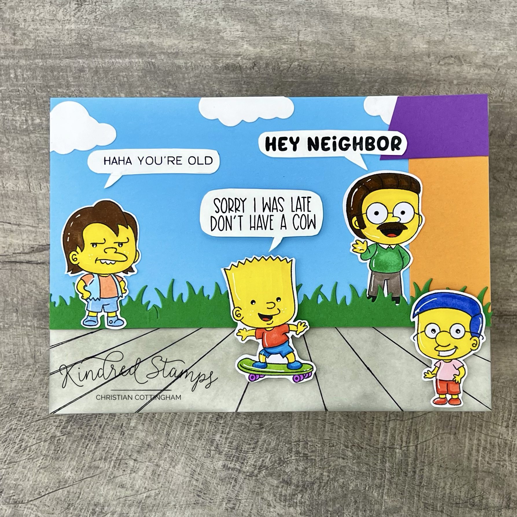
Project 7: Skating By
Belated birthday wishes happen… it’s just life so don’t have a cow. This card features 4 characters from the Nuclear Family kit.
The HaHa Boy, Son (with skateboard), Neighbor, and Best Friend were stamped with alcohol safe ink and then colored with Olo Markers (See Color Guide). Each of the characters were fussy cut out and set aside.
The bright solid colors made the background a breeze to make. A thin card stock panel was utilized as the base to add my elements to. On the lower portion of the panel, I drew some sidewalk lines and ink blended that section with Silver Stone ink from Altenew. The sky was cut out of a bright light blue card stock. This was glued to the thin base panel along the sidewalk line. Pulling out the Grass Scene Die and piece of bright green paper. The base of the die cut grass was cut with a flush end and applied in alignment with the sidewalk ledge. The house and roof were cut of plain card stock and adhered to the right hand side of the evolving scene. With a trusty pair of scissors, I cut out some cloud shapes to fill the sky and glued them down.
Finally, the sentiments were stamped on white card stock and cut out to mimic speech bubbles. To assemble the card, the panel was adhered to a A7 card base. Thin foam tape was applied to the back of the Son, Best Friend, and thought bubble and applied to the card base scene. The Haha Boy and Neighbor with their respective thought bubbles were glued flat to the card.
This scene on an A7 card sends those belated birthday wishes with some pizazz!
Card Size: A7 (5 by 7 inches)
Color Guide (Olo Markers):
Flesh on all the peeps> Y2.3
Dad>
Shirt> WG1
Pants> B2.4/ B2.2
Shoes> WG9/ WG5
Mom>
Dress> G0.4/ G0.1
Hair> B4.6/ B4.7
Pearls> WG1
Shoes> R0.5
Brother>
Shorts> B2.6/ B2.4
Shirt> R0.5/ R0.4
Tongue R0.5
Shoes> B2.6/ B2.4
Skateboard> YG1.4/ V2.4
Sister>
Dress/ Shoes> R0.5/ R0.4
Pearls> WG1
Baby>
Dress> B2.4/ B2.2
Nuk> R0.5/ R0.4
Aunt 1>
Pearls> 2.3
Hair> BV2.2
Dress> R1.7/ R1.5
Aunt 2>
Pearls> OR2.6/ OR2.3
Hair> BV2.2
Dress> B4.6/ B4.3
Shoes> B4.6/ B4.3
Neighbor>
Hair> OR3.8/ OR3.7
Pants> WG5
Shirt> V1.1
Sweater> G1.5
Shoes> WG9
Boss>
Shirt> WG1
Hair> B0.2
Tie> B4.7
Suit> G1.7
Shoes> OR3.8
Assistant>
Shirt> WG1
Jacket> YG8.7
Pants> BG7.6
Tie> BV1.7
Shoes> WG9
Hair> O2.7
Clown>
Gloves> WG1
Face> YO2.0
Hair> BG2.5
Nose/ Mouth> R0.5/ R0.4
Pants> G1.4
Shirt> BV2.3
Shoes> O2.7
Arch Nemesis>
Hair/ Shoes> O2.7
Pants> B4.6
Shirt> YG8.7
Cop>
Uniform> B4.6/ B4.7/ WG5/ Y1.2
Hat> B4.6/ B4.7/ Y1.2
Shoes> WG5
Hair> B0.3
Cop Son>
Shirt> B4.6
Belt/ Shoes> WG9/ WG5/ R0.5/ R0.4
Pants> R1.7
Glue> WG1/ OR2.3
Best Friend>
Shorts> R0.5/ R0.4
Hair> BV2.6
Shirt> R2.2
Bartender>
Apron> WG1
Hair> CG5
Shoes> WG9
Pants> WG5
Shirt> B0.3
Bowtie> 4.6
HaHa Boy>
Shirt> OR 2.3
Shorts> B4.3
Vest> B2.2
Hair> OR3.7
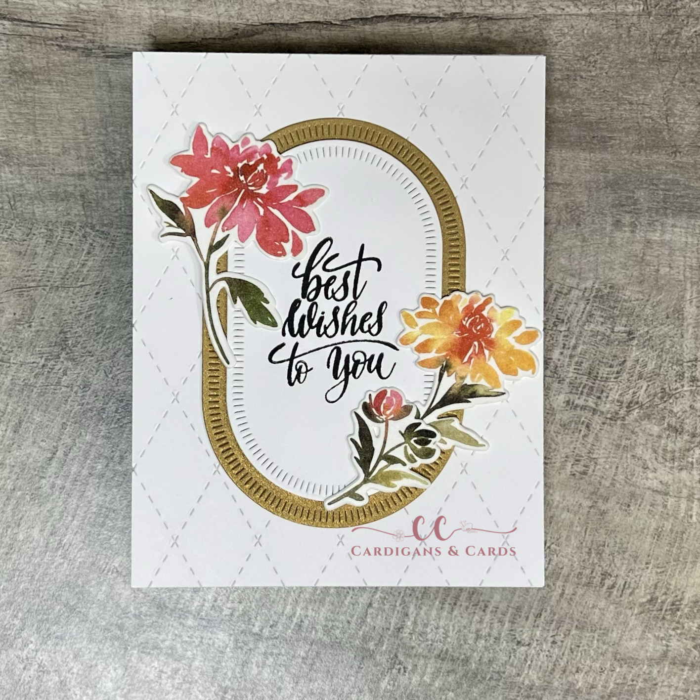
Clean & Simple Birthday Wishes
Clean & Simple Birthday Wishes are my favorite go to card. Check out this blog that highlights how to utilize Washi tape to make a stunning card.
My favorite cards are cards that have lots of resting space on the eyes that allow the sentiment or the focus be the show. This card exemplifies the simplicity but also has some pizazz. The crisp white of the base front with the watercolored looked of the Chrysanthemum make my heart happy.

I had purchased the PinkFresh Studios Chrysanthemum Washi Tape, Stencil, and Die Combo eons ago. I love that PinkFresh Studios have coordinating products that you can purchase exactly what is your jam. When I purchased these, I thought, I have never used the washi tape, that would make a fast card, and why not make my own ephemera for a card. So I dug out the Chrysanthemum washi tape, the matching die, and a piece of Hammermill card stock.
The washi tape was applied to a piece of card stock and burnished to ensure adherence. The coordinating die was utilized to die cut the floral washi tape images. I learned that you must tape the die securely if you are not utilizing a magnetic base in the die cutting machine. My first set that went through didn’t turn out so hot… okay at all. My die shifted and cut the floral into random shapes Note to self: use virgin low-tack tape (not something used 5 times prior) and more than 1 piece…. Second time through, was a breeze! The florals were stuck firmly to the card stock and I was in awe! Just like that, no coloring involved, I had floral and greenery pieces to make a beautiful card. These florals were set aside while I prepared the frame that the florals and sentiment would layer on.
I pulled out the Nesting Blanket Stitch Ovals by PinkFresh Studio and die cut 2 layers. One from a matte gold card stock and one from a piece of Hammermill card stock. The sentiment “Best wishes to you” from Gina K Designs Sweet Sentiments stamp set was centered on the smaller oval and stamped with Versafine Clair Nocturne ink.
The background card panel was cut down to 5.5 by 4.25 inches (Hammermill) and detail cut with Trinity Stamps Argyle Stitch Background Die. This die provides a texture without distracting from the sentiment and florals or adding unwanted color to the neutral zone. This was adhered to a top folding card base. The oval layers were stacked and centered onto the card front. Finally, the washi tape floral die cuts were arranged framing the sentiment.
This card would be so simple to mass produce for a variety of occasions. Birthday, celebration, sympathy, just because, you name it! I definitely will play some more with the washi tape pieces. Adhering and die cutting them out would be a perfect project to work on when the mojo is lack luster or while sitting down by the lake this summer. As I write this today, it’s a cold snow covered view of the lake and I am happy to be inside under a blanket sipping some hot cocoa.
Card Size: A2 (5.5 by 4.25 inches)
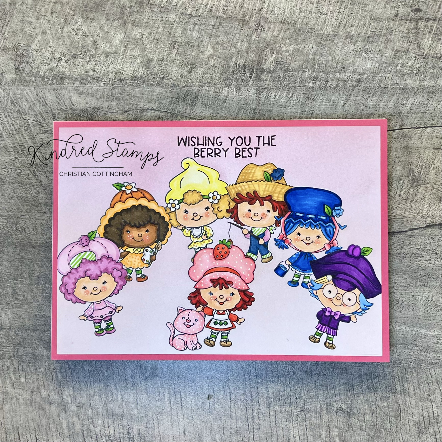
Kindred Stamps February Release: Fruit Friends
These tiny Fruit Friends are having a “berry” good time at the Kindred Stamps January Release!
When I was younger, I had a bedroom with pink curtains, pink area rug, a homemade bedspread by my godmother with the bedskirt attached to the top quilt covered in strawberries, and a strawberry toy box. The Fruit Friends stamp set and the Sweet Strawberries Paper Pack took me back to my bedroom as a child.
This blog utilizes affiliate links for the products that I utilized. By clicking on the links, you are supporting me without any cost to you. I thank you for your support if you choose to utilize the links provided. Let’s head down to the berry patch!

Fruit Friends, Kindred Stamps
Project One: Berry Bed
When I saw the papers in the Sweet Strawberries paper pack, I saw my bedroom quilt from childhood. My Aunt Karen (and Godmother) made my quilt out of the patterned fabric full of strawberries and gingham. The attached skirt on the quilt hid all my toys that I shoved under the bed when I was told to “clean” my room. Best invention ever for a 7 year old. This card showcases some of the patterns that were in my quilt.
From the Sweet Strawberries paper pack, I pulled out the green gingham, the framed strawberries on a pink with white polkadot background, and finally the red with white polkadot papers. The red polkadot paper was cut into a quarter inch strip. This quarter inch strip was then centered on the large rectangle for the Card Basics Die set. The Card Basics Dies panel was also utilized to cut both (gingham and strawberry) panels so that the stitched detailing would be consistent between all sections. The panels were sized to divide the main card panel into thirds separated by the red and white polkadot paper. The panels were attached together with liquid glue and set aside to dry.
The Red Girl from the Fruit Friends stamp set was colored with Olo Markers (see Color Guide below). She was fussy cut out and thin foam tape was applied. Utilizing a tag die from my stash, I die cut a simple stitched tag on a pink card stock. Thin foam tape was applied to the back of the tag and the card was assembled. I added the leftover red with white polkadot paper to the top of the tag. To embellish the card I added some pink and white clay hearts that I picked out a some limited edition Kindred Stamps shaker kits. I didn’t want a sentiment on the front of the card. It just didn’t feel right, so I placed the sentiment “Have a berry fun birthday” inside the card.
Card Size: A2 (5.5 by 4.25 inches)

Fruit Friends, Kindred Stamps
Project Two: Rainbow Berry Best
All I see is rainbows when I look at this Fruit Friends stamp set. So why not make a rainbow of Fruit Friends wishing the recipient the berry best??
Using simple masking techniques, I arranged the friends in rainbow order in an arch on my card panel to mimic a rainbow. The friends were stamped in alcohol safe ink and masking paper applied. The background was then ink blended in a gradient fashion with Concord & 9th Carnation and Ballet Slippers.
The Fruit Friends were colored with Olo Markers (see Color Guide below). White gel accents and black glaze pen were applied to the Fruit Friends as appropriate. The colored panel was cut down to 6.75 by 4.75 inches. The sentiment was stamped in pigment ink and Clear Embossing Powder was applied and heat activated. An A7 card base was prepped and a piece of 5 by 7 inch pink paper was adhered. The rainbow colored panel was centered and glued flat to the pink card base panel.
Card Size: A7 (5 by 7 inches)
Fruit Friends, Kindred Stamps
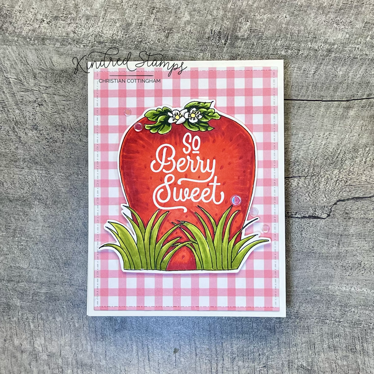
Project Three: Strawberry Toy Box
In my childhood bedroom I had a strawberry toy box. The plastic it was made out of had that artificial strawberry smell that I could identify even today. I know that the lid never really fit right on the top and according to my mother, it never actually had toys in it… This card is a tribute to my toy box as a child.
To make this card, I grabbed my pencil and sketched a strawberry and then a couple leaves and flowers on top. To add a little spunk, I used the Grass and Clouds stencil as my template for drawing the grass at the base of the strawberry.
To color the strawberry I utilized a combination of Olo Markers and Altenew Artist Markers. The leaves on the strawberry were colored with Altenew Artist Markers (G554/ G715/ G702). The flower was colored with Olo Markers (WG3; Y2.2). The berry was colored with Olo Markers (R0.6/ R0.5/ R0.4). Finally, the grass bunches were colored with Altenew Artist Markers (G915/ G804/ G825).
The sentiment “So Berry Sweet” was heat embossed with Snowfall Embossing Powder from the Fruit Friends stamp set. The strawberry design was fussy cut out and foam tape was applied. For the background of the card, I pulled out a piece of gingham paper from the Sweet Strawberries paper pack. This design was one of the blocks on my childhood quilt. I cut this panel down with the Card Basics Dies and adhered it to the card base. The strawberry was centered on the card panel. Because every little girl with a pink bedroom loves sparkle, I added some iridescent sequins for some bling bling.
I wonder whatever happened to my strawberry toy box. This card is my tribute to my fake plastic smelling strawberry toy box of years gone by. I salute you my friend, where ever you ended up. May your strawberry fields be of plenty.
Card Size: A2 (5.5 by 4.25 inches)

Fruit Friends, Kindred Stamps
Project Four: Strawberry Candles & Berry Wishes
Nothing says a birthday like birthday candles! The candles of this card showcase some of the linear pattern paper from the Sweet Strawberries paper pack and a couple Fruit Friends. To make this card a piece of pattern paper full of strawberries was adhered to an A2 card front.
With a piece of pale green card stock and the Skinny Plaid stencil a simple subtle backdrop with white pigment ink was made. When dry, the panel was cut down with the Card Basic die. The candles were cut into strips from the pattern paper and thin foam tape applied. The flames were cut from mirror gold card stock and thin foam tape applied.
The Blue Girl and Blue Boy were colored with Olo Markers and fussy cut out. (See Color Guide below). The sentiment from Fruit Friends, “Have a Berry Fun Birthday” was stamped in Red Hot ink from Gina K Designs, then with embossing ink. Clear Embossing Powder was applied and heat set. Finally the sentiment was framed with the same pale green paper that was used for the backdrop.
To assemble the card, the candles and flames were placed on the stenciled panel. The Blue Girl and Blue Boy were placed flat on top of the candles. Thin foam tape was applied behind the sentiment and centered on the candles. Finally the plaid panel was centered onto the patterned paper card front.
Card Size: A2 (5.5 by 4.25 inches)

Fruit Friends, Kindred Stamps
Project Five: Berry Artist
One of the Fruit Friends is an artist just like us who are making cards with this fun set! Because these Fruit Friends are so small, the little artist and her model are in between the blades of grass.
To make this card I got out my trusty pencil and started some sketching some long blades of grass that frame the center of the card panel. The horizon line was masked off and the the sky and then the ground were ink blended softly with Altenew inks in Arctic and Frayed Leaf respectively. The blades of grass were colored with Altenew Artist Markers in G554/ G715/ and G702. This panel was die cut with the Card Basic Die.
I pulled out the Art Supplies Die (retired) and die cut the easel 3 times and cut down to add the layers for dimension. The art easel was colored with Olo Markers to mimic wood (OR3 .8/OR 3.7/ OR 3.4). The canvas was partially stamped with the Cat and partially colored with Olo R2.2. The canvas was drawn in and colored with Olo Markers B0.2/ G0.1. The easel was assembled and set aside.
The Orange girl and her cat model were colored with Olo Markers and fussy cut out (see Color Guide below). The sentiment was stamped in Sapphire ink from Altenew and then ink blended with the Arctic ink to match the background sky.
To assemble the card, a deep green card panel was placed onto a card base. The grass panel was popped up with foam tape onto the base. The easel was centered between the blades of grass. The Orange Girl and her Cat model were popped up and placed in front of the easel. Finally the sentiment was popped up and centered on the top of the panel. The artists work is never done… so let’s move on to the last set of cards.
Card Size: A2 (5.5 by 4.25 inches)

Fruit Friends, Kindred Stamps
Project Six: Berry Gift Set
The Fruit Friends stamp set is perfect for making a card set as a gift for someone “berry” special. Each of the Fruit Friends are represented on their own card with their own saying.
Simple layered watercolor in a faux dip technique was painted at an angle for each of the friends in rainbow order. The sentiments were stamped in watermark ink and heat embossed with Snowfall Embossing Powder. The panels were cut down with the Card Basic Die and foam tape was applied to smooth out any warping that had occurred. The Fruit Friends were colored with Olo Markers (see Color Guide below) and fussy cut out. Thin foam tape was applied behind the Friends. These simple cards were assembled and ready to be given as a set to a “berry” special someone.
Card Size: A2 (5.5 by 4.25 inches)
The entire Kindred Stamps release will be available this Friday at 8am PST/11am EST. Be sure to subscribe to the Kindred Stamps blog to see a daily line up of sneak peeks from our amazing Design Team! Come join the Fan Club and release event to be part of the release fun, and you may just win some Kindred Stamps credit!!
Color Guide: Olo Markers unless otherwise noted.
Red Girl:
Flesh> OR2.0/ OR3.2/ OR4.2/ R0.3
Hat> R2.2/ R2.4; R0.5/ R0.4
Apron> WG1; YG1.4/ YG1.6
Tights> WG1; YG1.4/ YG1.6
Dress> R0.4/ R0.5
Strawberry> R0.4/ R0.5; YG1.4/ YG1.6
Shoes> O4.3/ O4.6
Hair> R1.5/ R1.7
Pink Girl:
Flesh> OR2.0/ OR3.2/ OR4.2/ R0.3
Leaf> YG1.4/ YG1.6
Flower> Altenew Artist Markers R603/ R614
Hat> Altenew Artist Markers R601/ R603; Old YG1.4
Dress> Altenew Artist Markers R601/ R603
Bloomers> Altenew Artist Markers R603/ R614
Hair> Altenew Artist Markers R603/ R614
Shoes> Altenew Artist Markers R603/ R614
Tights> WG1; YG1.4/ YG1.6
Orange Girl:
Flesh> OR3.2/ OR3.4/ OR3.7/ RV0.3
Tights> WG1; YG1.4/ YG1.6
Leaf> YG1.4/ YG1.6
Flower> O1.2/ O1.3; WG1
Dress> O1.2/ O1.3/ Y2.2
Hat> O2.7/O2.5/ O1.2/ O1.3
Shoes> O2.7/ O2.5
Hair> O7.8/ O7.7
Paint Brush> O4.3/O4.6; WG3
Pallet> WG3; YG1.4; Y2.3; R0.5
Yellow Girl:
Flesh> OR2.0/ OR3.2/ OR4.2/ R0.3
Hat> Y2.0/ Y1.2; YG1.4/ YG1.6
Dress> Y2.0/ Y1.2; WG1
Hair> YO2.3/ YO2.5
Flower> WG1; YO2.5/ YO2.3
Tights> WG1; YG1.4/ YG1.6
Shoes> YO2.5/ YO2.3; Y1.2
Blue Girl:
Flesh> OR2.0/ OR3.2/ OR4.2/ R0.3
Leaf> YG1.4/ YG1.6
Tights> WG1; YG1.4/ YG1.6
Shoes> B0.6/ B0.5
Bucket> B0.6/ B0.5/ B0.7/ B0.3
Dress> B0.3/ B0.5
Apron> B0.5/ B0.3
Flower> B0.5/ B0.3
Hair> B0.6/ B0.5. B0.3
Hat> B0.7/ B0.6/ B0.5/ B0.3
Ribbons> R2.2/ R2.4
Blue Boy:
Flesh> OR2.0/ OR3.2/ OR4.2/ R0.3
Leaf> YG1.4/ YG1.6
Bibs> B4.7/ B4.6
Kerchief and hems> YG1.4
Shirt> Altenew Artist Markers R601/ R603
Shoes> 04.3/ O4.6
Hat> YO2.3/ YO2.5
Flower> B4.7/ B4.6
Pole> O7.8/O7.7
Fish> O2.7/ O2.5
Purple Boy:
Flesh> OR2.0/ OR3.2/ OR4.2/ R0.3
Tights> WG1; YG1.4/ YG1.6
Leaf> YG1.4/ YG1.6
Hair> B0.5/ B0.3
Bow/ Shorts/ Shirt> V2.3/V2.8
Plum> V2.4/ V2.6
Pencil> YO2.3/ YO2.4; YO2.0; WG9; R2.2
Shoes> O4.3/ O4.6
Cat:
R2.4/ R2.2

Sweet Valentine’s
Sweet Valentines features stamps from Kindred Stamps for a special crafty friend!
I always loved making my Valentines box in grade school. Out came the shoebox, the construction paper, safety scissors, and glue stick. We had freedom to decorate that block with all the “love” things we could think of. As you enter middle school the fun fades. Then adulthood comes along and you rethink what is Valentine’s Day and who qualifies to receive your handmade valentines. Now, I make Valentine’s Day cards for those that I love and appreciate. This card is extra-special because it is going to a fellow Kindred Stamps fan as part of the monthly challenge card swap! I hope that this lucky friend has an amazing sweet Valentine’s Day.
This blog does contain affiliate links that you can click on if you feel so inclined to purchase supplies to make your own Valentine’s Day card. There is no cost to you, but you support my crafting addiction to bring more inspiration your way! For those new to Kindred Stamps, there are certain stamps that you may see that are not available to the masses because they were part of an exclusive kit or have been retired. This card does contain said stamps. So those Kindred addicts like me, dig into your stash and make you Valentine!

Sweet Valentine’s
This Valentine’s card is a single layer card that was then colored with Olo and Altenew Artist Markers. The scene was designed and simple sketching in pencil to provide the ground, greenery, and the sidewalk stand. The characters from The Great Box stamp set (retired) were stamped in Momento Tuxedo ink, with masking to have the girl behind the stand. Utilizing alcohol safe fine liner pens from Altenew, the sketched scene was traced. Because there is always a little fee for any advice or services rendered, the sign needed to be updated. The sign was handwritten in the same alcohol safe fine liner pens.
Just like a coloring book, my scene was ready to be brought to life. The card panel was colored and allowed to dry. The sentiment was a combination of a couple stamp sets to achieve the double layered sentiment that I was looking for. The top line of the sentiment “Have A” from the 2021 Virtual Retreat Pals stamp set (retired) was stamped with Versamark embossing powder and embossed with Snowfall embossing powder (Kindred Stamps) twice to have the thickness I was looking for. The second line “Sweet Valentines Day” was modified from the Galactic Hunter stamp set. I covered the “A” at the beginning of the sentiment and inked with Versamark ink and embossed with Snowfall embossing powder twice.
The eyes of the characters were hit with a black glaze pen to give a little reflectivity and white highlights were added with a white gel pen. My valentines for my Kindred Stamps secret valentines is complete and ready to be sent!
Card Size: A6 (6.25 by 4.5 inches)
Color Guide:
Sky> Altenew Artist Markers
BG3
Grass> Altenew Artist Markers
G702
Bushes> Altenew Artist Markers
G702/ G715; R504/ C003
Sign> Altenew Artist Markers
WG01/ WG03
Stand> Altenew Artist Markers
C013/ C014
Girl> Olo Markers
Flesh> OR4.4/ OR 4.2/ OR4.1/ R0.2
Dress> W-G1/ B0.5/ B0.3
Hair> C-G 9/ C-G 7/ BK
Boy> Olo Markers
Flesh> OR4.4/ OR 4.2/ OR4.1/ R0.2/ R0.5/ R0.6
Shirt> Y2.3/ Y2.2/ W-G 9
Shoes> W-G 1
Socks> Y2.2
Shorts> W-G 7/ W-G 9

Kindred Stamps January Release: Trip to the Arcade
Trip to the Arcade was a trip down memory lane. Kindred Stamps January Release Arcade Die and Arcade Stamp Set are featured here. Can you hear the music?
Nothing screams a child of the 80’s as saving up all your quarters and heading to the arcade to test your hand-eye coordination while listening to 80’s pop radio with your friends. The colors, sounds, and smell of Electric Youth and Polo (which were 100% Designers Imposters but no one would admit it). These sites and sounds echo in my brain as I worked on the cards for Kindred Stamps January release.
This blog utilizes affiliate links. These links take you to the products that I utilized while making these retro arcade cards. When you use the affiliate links, you are supporting my creative inspiration at not cost to you. I utilize the proceeds to purchase further product to keep the fun coming!

Arcade Die & Arcade Stampset, Kindred Stamps
Project One: You’ve Got Game
Can you hear the tense music playing? Are you ready to shoot some lasers? This card features the Arcade Die and the Arcade Stamp set to take you back in time to the arcade.
The background was designed to mimic the creatures falling from the sky in geometric pattern. The creatures were inked with Lucky Clover/ Passionate Pink/ and Soft Stone by Gina K. The fighter ships were cut from the same smooth white card stock, colored with Olo Markers (CG7/CG5), and adhered to the center of the creature columns. This was set aside for the coloring of the Arcade Die.
The Arcade Die was cut out of white smooth card stock and select pieces from black card stock. The base was colored with Olo Markers (BG0.4/ BG0.7/ BG0.8) to add depth to the crevices. Once complete, this was set aside.
The front panel was up next. To achieve the landscape that I wanted, I pulled out the Desert Scene Layering Stencil and picked out a section of the rock formation to trace with pencil. With an alcohol safe pen, I re-traced my lines for the formation onto the front panel. Because this formation was based off a stencil, it lacked the definition lines. I added some ledges and layers then colored the rocks with Olo Markers (OR2.5/ OR2.6). The sky was colored from lightest to darkest with Olo Markers (BG0.4/ BG0.7/ BG0.8).
The donation panel (I mean change collector) was paper pieced together after all components were colored with Olo Markers (CG5/CG7; CG3; Y2.3/ Y1.2/ OR2.5). To assemble, the frame was centered on the top center of the landscape front panel and the individual pieces were adhered.
The controller panel was colored to reflect the power of threes. Meaning, there are 3 reoccurrences of the same color to provide a cohesive look. The orange in the landscape, the money collector and then the base of the controller panel (Olo Markers OR2.5/ 2.6) were the first set of 3’s. The knobs and buttons followed with the blues from the sky and the base of the die (BG0.4/BG0.7/ BG0.8) and the yellows from the topper and money collector (Y2.3/ Y1.2). The monitor of the gaming counsel rounded the power of three by coloring the monitor with the same Olo Markers (CG5/CG7) as the money collector panel and fighter ships. That’s a lot of 3’s.
To finish up the Arcade Die, the topper was colored with Olo Markers and allowed to dry completely (Y2.3/ Y1.2). The sentiment “Congrats” was stamped in Versafine Clair Nocturne ink and heat embossed with Clear Embossing Powder. The screen was stamped with Versamark and embossed with Snowfall Embossing Powder.
Finally, it was time to assemble the card. The center panel was cut out of black card stock and popped up with foam tape. The Arcade Die was also popped with with thin foam tape. The layered panel was centered on the front of the card base. Holographic card stock strips were adhered to the sides of the card base and the black panel. The fighters needed to at least try to fight back so a gray enamel dot from the Kindred Spirits Enamel Dots was the perfect little laser bullet. Pew pew pew…
Card Size: A2 (4.25 by 5.5 inches)

Arcade Die and Arcade Stamp Set, Kindred Stamps
Project Two: Game On
This hungry yellow guy just can’t get enough, now if those specters would stop chasing him maybe he’d get his fill. This card takes me back to the pizza place that we would go to as kids. The smell of pizza baking, a pitcher of soda (the only time we really got the bubbly goodies), the sound of laughter, and little dots being munched down by this yellow guy.
The frame for this card acts as an all you can eat buffet of dots! The yellow guy (Arcade Stamp Set) was stamped in Wild Dandelion, while the specters were stamped in Blue Lagoon and Passionate Pink from Gina K. Pulling out the trusty exact-o-knife, I cut the eyes and images out. The dots were found deep in my stash from probably about 18 years ago and were adhered. Foam tape was applied and the frame was set aside.
Next up, the Arcade Die! This one is definitely cleaner than the one at the pizza place, but I colored it in the same color theme. The die was cut from smooth white card stock and ink blended with inks from Gina K. I repeated the die cutting with black card stock on a few select areas. The base and front panel of the die set were blended with Blue Raspberry and Blue Denim. The change collector was blended with Wild Dandelion and Stormy Sky. The quarter slot was colored with Altenew Artist Marker TG03.
The control panel was given shadows with Altenew Artist Marker (TG03) as well as a couple buttons and a knob. The remaining knobs and joint stick were ink blended with Wild Dandelion and Cherry Red (Gina K). To complete the topper, Versamark was utilized for an emboss resist technique with Clear Embossing Powder and inked with Wild Dandelion. The ink was removed from the embossing powder with my Kindred Microfiber Towel. The screen was the only thing left! The heart was stamped in Cherry Red from Gina K and allowed to dry. Once dry, Versamark was stamped over the heart and embossed with Clear Embossing Powder to add some shine. To complete the rails, a little shadow was added to the bottom (just like at the pizza place… I imaging it was once white). The die was assembled and foam tape applied.
Prior to assembling the complete card, remainder of the background needed attention. Utilizing a vibrant blue card stock, the Warp Speed hot foil plate was heated up and iridescent hot foil applied. The radiating lines draw your eye to the soon to be focal point of the Arcade Die. The card was assembled and I am ready for a piece of pizza, a picture of soda, and a few quarters to try my mad skills!
Card Size: A6 (4.5 by 6.25 inches)

Arcade Die and Arcade Stamp, Kindred Stamps
Project Three: Framed Level Up
Have you ever thought of how good of a packer you are? You know, how you can cram sooooooo many crafty goodies in such a small space. Just visualizing the shape and determining where it will fit best. If you can relate, I’m guessing this card speaks to you!
This card layout is so simple… A fun lava card stock in a brilliant blue was attached to the card base. A simple frame cut from black card stock was popped up with a little foam tape and adhered in the center of the lava panel. The star of the show is up next, the colorful die cut!
The Arcade Die was cut from smooth white card stock and a few select pieces from black card stock. The base was colored in color blocks that reflect the colors of the game pieces. Utilizing Olo Markers (Y2.3/Y1.2; BV1.4/ BV1.7; YG1.6/ YG1.4; R0.6/ R0.5) and Altenew Markers (B204/ B201) to color the die, I was able to add some depth to the die cut. To emphasize the angles, a black fine liner pen was used to draw in sharp lines. The control panel pieces were colored with the same color theme. Finally, the change collector was colored with same blues and yellows, and the quarter slot was colored with Olo Marker CG3.
The front panel is where the money is at! A thin frame was drawn with an alcohol safe fine liner pen. The various shapes from the Arcade Stamp Set were inked with 5 different colors from Gina K (Dark Lilac/ Luck Clover/ Wild Dandelion/ Tangerine Twist/ Blue Lagoon) with intentional gaps. Random falling shapes were stamped from the top down. Using the CG3 Olo Marker, the background was colored to complete the panel’s aesthetic. The red boarder was filled in with Olo R0.6/ R0.5.
To finish the Arcade Die, the sentiments from the Arcade stamp set were stamped in Versafine Clair Nocturne ink after shadowing was added with the CG3 Olo Marker. The die was assembled and foam tape applied. All that was left was snugly centering the die perfectly into the black frame. A skill I mastered in my youth. How about you?
Card Size: Mini-Slimline (6.25 by 3.25 inches)

Arcade Stamp, Kindred Stamps
Project Four: Congrats, A New Player Has Entered The Game
Who says wedding cards have to be all lovey dovey when they can be just awesome! The first card I made with the Arcade stamp set was this wedding card. I just couldn’t help myself. This clean and simple card consist of 2 sentiments and 2 images from the Arcade Stamp Set.
Utilizing the Card Basics Die, a black panel was cut out. A second white card base was cut out with the same die and then trimmed to remove the stitched outer lines (you could also just use a A2 die, but why get up and walk to the die machine when the trimmer is right there…). With my layers prepped, I could get down with the stamping.
The heart was stamped first in Cherry Red ink from Gina K. Then the Yellow Guy was stamped on the left hand side of the heart in Wild Dandelion (Gina K). To stamp the Yellow Gal, I removed the panel from my stamping platform and stamped the image onto the base of my stamping platform. I do have a clear polymer stamping pad inside my platform. To complete the reverse image, I placed my panel ink side down onto the stamping platform and rubbed over the area that I had stamped. This process was repeated to achieve the color saturation I desired. On a scrap of card stock, the t-shaped stamp was inked up with Cherry Red (Gina K) and then fussy cut to only form a “V". This bow was adhered to the Yellow Gal. The images were outlined with a fine line black pen to define the edges of the yellow stamped images.
The sentiment “Congrats” was stamped below the scene and “a new player has entered the game” to the inside of the card base in Versafine Clair Nocturne ink. The black Card Basic die panel was adhered to the card base and the inked panel was adhered with some foam tape on top. To make the heart glisten like true love, I applied some Glossy Accents for shine. Then finally, to ensure the new couple had the power to get through their honeymoon, a few Magic Seasons Enamel Dots were applied. (Wink, wink…)
Card Size: A2 (4.25 by 5.5)

Arcade Stamp Set, Kindred
Project Five: Aliens Are Coming
Fighter jets at the ready! This card is takes the sentiment and turns it into a fighter jet to take on the aliens! Only 2 stamps from the Arcade Stamp Set were utilized with the blackout technique. A fun technique to play with!
The background came together with the Desert Layering Stencil by using the positive and negative cuts. The other worldly scene was ink blended (Sweet Mango/ Tomato Soup/ In the Navy/ Sweet Corn/ Wild Dandelion from Gina K). Some metallic spatter was applied and the background was set aside to drive.
The aliens were up next! Using the blackout technique, I was able to have the various colors on each row. To achieve this, I masked a piece of paper with a sticky note and ink blended the top row with Keylime (Gina K). The mask was removed and reapplied to the top and bottom of the next row to be inked leaving space for the image to be applied. This was then inked with Bubblegum (Gina K). This panel was allowed completely. Don’t skip this step, you will be sad…. I aligned the alien stamp into the stamping platform and prepped the panel with an antistatic tool. The alien image was stamped in columns by simply adjusting my panel to stack the aliens in the colored rows with embossing ink. Clear Embossing Powder was applied and heat set. The alien was cleaned, moved to the next column, retreated, stamped, powdered, and heat set 2 more times. Now that all of the shiny aliens were ready and cooled, it was time to make the magic happen.
To complete the blackout technique, I pulled out Distress Black Soot ink and a foam blending tool. To protect the panel from my finger oils, I did use some post-it tape, sticky side up, on my fingertips for holding the panel down. The entire panel was inked heavily with black ink to cover all color rows and white space. Using my Kindred Microfiber Towel, I buffed the embossed aliens clean of the black ink. The aliens came to life!
The sentiment “You Got Game” was stamped and embossed with Snowfall Embossing Powder and fussy cut out leaving a canon on the top. Foam tape was applied to the alien panel and the sentiment spaceship. To assemble the card, the alien world background was applied flat to a card base. The alien panel was popped up on the center upper portion of the world scene. The sentiment spaceship was centered on the bottom of the card. Utilizing some random pearl square shaped embellishments from probably 20 years ago (unknown supplier) I added some laser shots onto the scene. See, it pays to be a hoarder… you never know when you may actually use them!
Card Size: A2 (4.25 by 5.5)

Arcade Stamp, Kindred
Project Six: Our Friendship Box
This fun fold card looks lack luster on first look, but when you open it up there’s a surprise for you! Let’s just say, it “falls” into place when opened.

Arcade Stamp, Kindred Stamps
A top folding card base was scored at 5.5 inches and 1.5 inches. A black A2 card panel was cut to remove 1.5inches from the bottom of the card. These panels will be adhered above and below the score line in a hot second. But first, using a black bleed proof pen on the scored card base, I traced a line above the 1.5 inch score line, through the channel of the 1.5 inch score line, and directly below the 1.5 inch score line. The black panels were adhered to the card base above and below the card stock. By tracing the score line, the color is seamless without having a dark card base which would make the card insides heavier. I don’t want pay for more postage…
Medium and small stars from the Card Basic dies set were cut from holographic card stock. On a scrap piece of white card stock, neon inks were applied in sections for die cutting and for the layering frame that surrounds the sentiment on the front of the card (Electro-Pop inks: Raging Red/ Orange Glow/ Hello Yellow/ Screamin’ Green/ Blaring Blue/ Potent Purple). Utilizing the Stitched Alphabet die, the word “ARCADE” was die cut. Finally, the sentiment was stamped on a piece of black card stock with embossing ink, covered with Snowfall embossing powder and heat set (Arcade Stamp Set). The front panel was assembled.
To make the fun fold, another piece of smooth white card stock (7 by 4.25 inches) was scored at 1.5 inches and 5.5 inches. Pulling out the square from the Card Basic Die set, the square was centered in-between the score lines. Do not discard the cut square, this will be used in a few. Using Altenew Artist Markers (TG05/ TG07), the frame around the cut out was colored. Again going outside the score lines for color transition. A piece of black card stock was cut to fit the backside of the card front and adhered. The inside frame and the card base were set aside to complete the inside image.

Arcade Stamp, Kindred Stamps
Remember the die cut that we set aside from the Card Basic square die? Gotta find it again… under a pile it was located. With a ruler I sketched out 2 rectangles with corresponding frames. Using the shapes from the Arcade stamp set, I stamped a layered board in the larger rectangle and a single shape in the smaller rectangle. (Gina K: Dark Lilac/ Lucky Clover/ Wild Dandelion/ Tangerine Twist/ Blue Lagoon). To fill in the stark white of the rectangles, I pulled out a Olo Marker in CG3 to fill in around the shapes. The frames of both rectangles were colored with Altenew Artist Markers (TG05/TG06). Finally the remainder of the square was colored with Olo Marker B4.6. The completed scene was centered on the black card stock on the inside of the card base.

Arcade Stamp Set, Kindred Stamps
Time to attach the our frame to the card base. After re-enforcing the score lines, the 1.5 inch on the framed piece was adhered to the top of the card front on the inside. Ensuring that the colored frame when folded up flows to the inside. With the card opened I folded over the frame. When laying flat it will fit perfectly into the card front (A2 sized panel). Place adhesive on the 1.5 inch section of the framed piece. Fold the card to adhere the fun fold to the inside card base. The panel will now open and close exposing the framed image. I added a piece of black card stock to the base inside the frame continue the framed area. To finish off the card, the sentiment “is on another level” was stamped in black ink. This felt a little naked with all the neon on the front of the card, so I placed a scrap of the neon inked paper and a strip of holographic paper. Tada, no longer naked!
Card Size: A2 (4.25 by 5.5 inches)
The entire Kindred Stamps release will be available this Friday at 8am PST/11am EST. Be sure to subscribe to the Kindred Stamps blog to see a daily line up of sneak peeks from our amazing Design Team! Come join the Fan Club and release event to be part of the release fun, and you may just win some Kindred Stamps credit!!

New Year, New Beginnings
New Year, New Beggings. Celebration of the Lunar New Year.
The lunar new year is upon us and the year of the snake will begin. What a better way to celebrate than to share a red envelope filled with wishes of prosperity. This set was developed for a good friend of mine and for her daughter. The dragon on the card comes to life and wobbles it’s head just like in the dances. While the little red envelopes contain a little “coin” with the year of the snake and lunar new year wishes to be shared with family and friends.
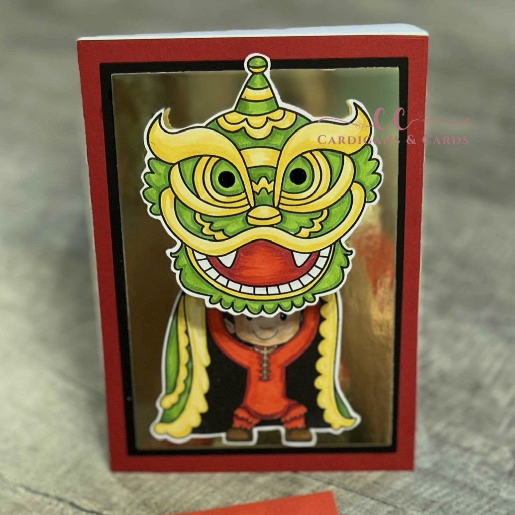
Project One: Dragon Dance
The card was stamped with Trinity Stamps Dragon Dance stamp set in Pink Fresh Studios Detailed Black alcohol safe ink. Images were colored with a combination of Olo markers and Altenew Artist markers (see Color Guide) on X-press It card stock. The eyes of the dragon and the dancer eyes were filled in a black glaze pen to bring them to life. The images were fussy cut out and set aside while I designed the card base.
Utilizing Waffle Flower A2 Layering dies, the card panel was cut from Gina K Designs Red Velvet card stock. The black panel was cut out of Gina K Designs Onyx black paper and then the inner rectangle was cut one size smaller on a mirrored gold card stock from my stash. These panels were layered together with Gina K Connect glue and attached to a top fold A2 card base.
The sentiments from the Mama Elephant New Beginnings stamp set were stamped in Versafine Clair Nocturne ink.
The dancer was adhered flat to the card and an action wobbler was placed behind the dragon head. Now the dragon’s head dances!
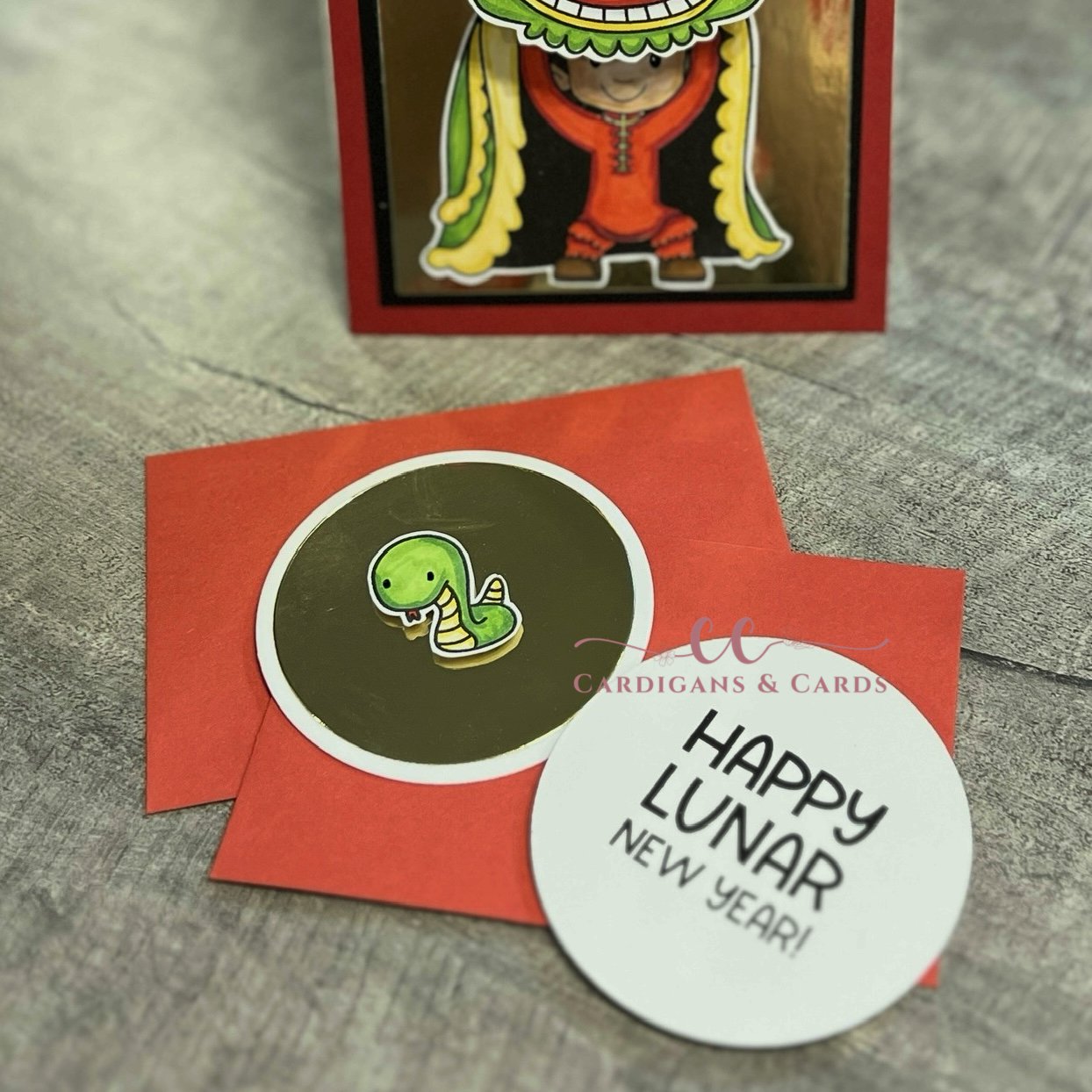
Project Two: Coins for Luck
The little red envelopes are filled with Happy Lunar New Year paper coins for a special little girl to share with her cousins this New Year.
The coins were cut from Pink and Main Nesting Circles to fit into the envelopes. On the back side of the die cut, “Happy Lunar New Year” was stamped in Versafine Clair Nocturne ink. Utiliizing a smaller circle die, and shiny mirrored gold card stock a smaller circle was cut out to allow a heavy frame.
The snake from the Lunar Animals stamp set by Mama Elephant was stamped in Pink Fresh Studios Detailed Black ink on X-press It card stock, colored with the same markers (see Color Guide) and fussy cut out. A black glaze pen was utilized to give the eyes the shine they needed. Placing some Altenew Instant Dimension Foam Tape to back of the images.
The snake was centered on the mirrored gold circle. The Year of the Snake has begun!
Color Guide:
Dancer:
Flesh> OR 7.2/ OR 7.4/ OR 7.2 (Olo)
Hair> OR 3.7/ OR 3.4/ BK (Olo)
Clothes> R 0.6/ R 0.5 (Olo)
Shoes> OR 3.8/ OR 3.7 (Olo)
Dragon: (includes dancers cloak)
Altenew Artist Markers> Y205/ C001
Olo> YG 1.4/ YG 1.6/ CG 1 for teeth/ R 0.6/ R 0.5 for mouth
Snake:
Olo> YG 1.4/ YG 1.6/ R 0.6
Altenew Artist Marker> Y205/ C001

January Kindred Stamps Challenge
Snowy challenge from Kindred Stamps monthly challenge! Galatic Travels to the rescue!
When the challenge of “Snow” was placed for the Kindred Stamps monthly challenge, for January I knew exactly what set I was pulling out from my stash. Nothing says snow like a snowy landscape from a far far away world. This single layer scene card was a breeze to make!
This blog utilizes affiliate links for the products utilized. These links provide a way for you to support me in the content that is provided at no cost to you. If you feel like you must have this set or product the links provided will take you right to the Kindred Website. Now, lets begin this chilly scene build.

Galactic Travels, Kindred Stamps
The Walker from the Galactic Travel stamp set was stamped utilizing masking to have the pairs walk in tandem on the lower portion of the landscape card base. The Flyer was stamped in the top right hand of sky. All images were stamped in alcohol safe ink (Momento Tuxedo). The mountains were hand sketched in pencil and then traced with an alcohol fine liner pen (Altenew). Now that the panel was ready, the coloring begins!
Knowing this was a snowy scene and the Walkers were also white, I wanted to ensure there was a difference between the background and the Walkers. The Walkers utilized cool gray tones while the mountains and ground were in cool blue violet tones. To differentiate the Flyer, warm gray tones were utilized. The sky filled in with a cooler blue to keep the chilly scene ambiance. See the Color Guide for the marker brand and colors.
The sentiment was stamped with embossing ink and Snowfall embossing powder was heat set on the left side of the scene. As part of the challenge this month extra points were given if your utilized some Magical Season Enamel Dots from Kindred Stamps. I found these red sparkly dots that looked like the laser bullets shooting from the Flyer. My card was now complete!
Card Size: A2 (5.5 by 4.25 inches)
Color Guide:
Walkers:
Olo Markers: CG1/ CG3
Mountains/ Snow:
Olo Markers: BV2.2/ BV2.0/ B2.0
Sky:
Altenew Artist Markers: R916/ R912
Flyer:
Olo Markers: WG5/ WG3/ WG1/ O2.5/ R1.5/ B2.0

YAY SCIENCE!
YAY Science! This scientist and his assistant are always confirming ways to not to be successful. Yay SCIENCE!
Sometimes while you are sleeping, you dream of many things. The future, the past, the weird, the scary, the what the hell was that, and then you dream of card making and science. Two things that at first do not seem to correlate, and then the more you think about it the more they do! You test out different inks to find the one that works with your medium for coloring. You test different papers to find the one that works for the task at hand. You play with thermal conduction to change the state of embossing powder into a solid smooth design. You mix alcohol ink to make new colors. You have to try different things over and over again until you are able to get a product in the end that you love. You learn 10,000 ways NOT to do something. That is not failure, that is science! These 2 science geeks are always testing and learning. This is who I was dreaming of… why? Science…
You will see affiliate links embedded in this blog. If you are inspired and want to support me at no cost to you, you can shop via the links. The proceeds from these links are utilized to purchase more crafty supplies to keep inspiration coming.
The scientist and his assistant from the Showtime stamps (Kindred Stamps) were stamped in Memento Black ink on Hammermill card stock, colored with Olo Markers (see Color Guide), and die cut with the Showtime dies. Full disclosure, I was not a fan of the original color of flesh for the scientist that I selected. His flesh was colored last and I was not re-stamping and coloring because, it’s fine and I am lazy. Because alcohol markers are translucent, I picked a muted yellow tone combo and colored over the top of the brighter tones. In the color guide I listed both colors. However, next time I color the image I will use the muted tones. See, science… I tested and found I didn’t like it and I tried again.
The lab scene background was die cut from a piece of pattern paper from the Dessert Royalty paper pack (Kindred Stamps) with the square from the Cards Basics Dies (Kindred Stamp). The Science Lab dies set (Kindred Stamps) were die cut from Hammermill card stock and colored with Altenew Artist Markers (see Color Guide) and assembled. To give the illusion of liquid in the beakers, Glossy Accents were applied to the colored layers and allowed to dry. The wall felt a little naked, so I drew a frame on Hammermill card stock and used Altenew Artist Markers to color the chalk board. The sentiment from Science Geeks (Retired> Kindred Stamps) was heat embossed with Snowfall embossing powder to mimic my science class room in high school.
A panel of In the Navy card stock (Gina K Designs) will be the base of this card. Prior to assembly, the sentiment from Showtime Sentiments (Kindred Stamps) was heat embossed with Snowfall embossing powder (Kindred Stamps).
The lab scene was assembled and adhered to the pattern paper flat. The Lab scene panel was popped up with Simon Says Stamp Big Momma Foam (thin foam) on the solid embossed card panel. The same foam was then placed on the back of the scientist and his assistant and they were placed in the scene.
Finally, a couple of white and navy enamel dots from Kindred Stamps were placed to frame the sentiment.
This card was in my dream and now it has come to life! YAY for learning 10,000 ways NOT to do it! YAY science!
Color Guide:
Scientist> Olo Markers
Lab coat> W-G1
Vest> YG8.7/ YG8.5
Tie> R0.5
Shirt> W-G1
Pants> O7.7/ O7.8
Shoes> W-G7/ W-G5
Flesh> Y1.1/ Y1.2/ YO2.0/ YO2.2
Assistant> Olo Markers
Flesh> OR1.1/ OR1.2
Hair> OR2.3/ OR2.2
Mouth> R0.6/ R0.5
Shirt> B0.2
Tie/ Pants> W-G7
Shoes> W-G7/ W-G1
Lab Coat> W-G1
Science Lab> Altenew Artist Markers
Microscope/ Table/ Stand> TG05/ TG07/TG05
Glassware> CG01
Fluids> (test tubes didn’t make the card, but colors listed) Y608/ Y518; B314/ B216; G503/ G515; C006/ R826; Y205/ C001; B815/ B714; R304; R318
Frame> Altenew Artisti Markers
TG05/ TG03; Y762/ Y932

Kindred Stamps December Release: X-Ceptional Team
X-Ceptional Team to the rescue for any of your card making needs!
Being part of team is something we all dream of from a kid on through adulthood. Now let’s be real, a team does not mean just sports. How many others were the Gutter Ball Queen in the Girl Scouts Father Daughter bowling tournament when they were growing up? I don’t believe I am all alone. In my mind, a team is a group with a common goal. That goal can anything from world peace to making something unique and homemade. I’m glad you’re on my make something fun team! The X-Ceptional Team stamp set from Kindred Stamps is another great team out to make the world better and this set let’s them shine.
Before we start into the projects, I wanted to let you know that this blog contains affiliate links to the amazing products that I utilized. If you choose to utilize the links, you are supporting me at no cost to you. With the compensation, I purchase product to continue to bring inspiration to you.

X-Ceptional Team, Kindred Stamps
Project One: Perfect Storm
Can you feel the weather change? This first project exemplifies having your own personal weather patterns, not hormonally induced if you know what I mean. The main character is set in a swirling light reflecting column of wind reflecting her power.
To achieve the holographic swirl, the Aloha Hot Foil Plate was re-imagined. Waves in the water can be waves in the sky if you turn the plate to be vertical. After the hot foil was cool, the Grass and Cloud Stencil was utilized with some moody light gray to reflect the storm that was brewing.
The card panel was cropped with the Card Basics Die to add a black frame from the card base. The flying woman was colored with Olo markers (see Color Guide) and popped up with some foam tape in the center of the holographic swirls.
The sentiment was stamped and heat embossed with Snowfall embossing powder. I adhered the sentiment flat to the card to allow the flying woman the respect and attention she demanded.
Card Size: A2 (5.5 by 4.25 inches)

X-Ceptional Team. Kindred Stamps
Project Two: Ace
If you’re lucky, this Card Slinger will let you know you’re X-ceptional. My inspiration came from the card in his hand and I knew this card was going to be an Ace. The Card Slinger was colored with Olo markers (see Color Guide), fussy cut out on the line, and edged with a black marker.
The playing card was the next step. Utilizing the Heart Layers stencil, the smallest heart was stenciled in red ink. To ensure the red of the heart matched the letters of the card, I inked up a piece of white card stock with the same red ink and set it aside to dry. To finish the playing card, I grabbed a fluorescent pink ink. The negative cut out from the stencil was applied over the heart to protect the red ink and the remainder of the card was ink blended with a heavier hand on the outside and lighter toward the center. Hello neon pink!
With the Card Basic die, the playing card was die cut and adhered to a black card base. The Stitched Alpha die cut out the “A” from the previously inked up red piece of paper. The “A’s” were applied to the upper left and lower right of my pink panel to mimic the playing card. The Card Slinger was applied with thin foam tape to the center of the heart. “You’re X-Ceptional” was heat embossed with Snowfall embossing powder and adhered with the same thickness of foam tape under the Card Slingers feet to ground the image.
To bling up the dazzling playing card, I added a shimmer pen to the the “A’s” and the around the boarder of the stitched edging. This made the playing card come to life. I wish photos could show the sparkle.
Card Size: A2 (5.5 by 4.25 inches)

X-Ceptional Team, Kindred Stamps
Project Three: X-tra Special
This X-tra special couple are sending birthday wishes in this bright card and shiny card. The All Seeing Eye Woman and the Vision Man were colored with Olo Markers (see Color Guide) and cut out.
The background panel was hot foiled with the Crown Plaid hot foil plate in a bright cobalt blue on an equally bright yellow card stock. Utilizing a flat hot foil plate, I pressed the negative foil into another piece of yellow card stock. With the Card Basic die, the main background panel with the largest rectangle die. Then the reverse foiled card stock was die cut with the smallest circle die. Since I was die cutting, I used the largest circle to cut a peace of vellum to layer beneath the foiled circle.
The sentiment was embossed with Snowfall embossing powder. To assemble the card, a blue card base was prepped. The yellow foiled panel was adhered flat to the base. The reverse foil circle and vellum were glued together and thin foam tape was applied to give the circle lift off of the base. The characters were edged in black and thin foam taped applied to provide separation between the paper.. The sentiment was adhered flat to the circle with a little foam tape on the overhang to prevent saggy sentiments… no on wants that. With all the shine on the card, no extra bling was needed.
Card Size: A2 (5.5 by 4.25 inches)

X-Ceptional Team, Kindred Stamps
Project Four: On My Mind
No matter what the situation is the sentiment of this card can apply. “You’ve Been On My Mind.” This interactive card showcases the Head Master and he stealthy carriage. The Head Master was colored with Olo markers (see Color Guide) and set aside to work on the background.
A yellow pearl paper panel was cut out and adhered to a black card stock mat. With the same black paper, the City Scape die was cut out and glued to the yellow pearl paper. This was set aside to dry while more die cutting commenced.

X-Ceptional Team, Kindred Stamps
The Pull and Slide die set provides the interactive part of this card. The pull was cut from same black paper, as well as the circle for mounting the Head Master. The label for the pull was cut from both red card stock and yellow glitter card stock. Finally the slit and the cut-out die was positioned on the card panel with the City Scape scene and cut out. The pull was assembled and the negative piece from the slit was applied to the pull. The pull was trimmed to line up with the buildings to keep the scene complete when the pull was returned to the neutral position. The red label was place on the end of the pull and the yellow glitter arrow was inlayed into the label. Foam tape was applied to the back of the panel around the mechanism to allow space for the pull to slide in and out. The Head Master was applied and ready for action.
The sentiment was stamped and heat embossed with Snowfall embossing powder and nestled into the top left corner to avoid interference with the Slide Out mechanism. I just love the sentiment. I always need one of these cards in my stash. Can be used for everything and anything.
Card Size: Mini-Slim line

X-Ceptional Team, Kindred Stamps
Project Five: No… You’re a Beast
Kind and gentle, yet a beast at the same time. This Furry Man is the star of this card and with an action wobbler he is X-tra special. The Furry Man was colored with Olo markers and cut out (see Color Guide).
The card base was made out of holographic card stock and set aside. To draw the eye to the our Furry Man, a piece of blue card stock was hot foiled hot foiled with the Warp Speed hot foil plate in a silver iridescent foil. The foiled card panel was cropped down with the Card Basic die set. Thin foam tape was applied and the foiled panel was placed on the card base. An low profile action wobble was placed behind the Furry Man and placed on the card base.
“You’re a Beast” was embossed with Snowfall embossing powder and placed directly on the card base to ensure there was clearance for the wobbler to wobble. This simple card has lots of character and can be easily mass produced for gifts.
Card Size: A2 (5.5 by 4.25 inches)

X-Ceptional Team, Kindred Stamps
Project Six: Whole Team Wishes
A simple grid layout showcases all of the amazing characters in the X-Ceptional Team. The characters were colored with Olo markers (see Color Guide). The team was cut out and thin foam tape was applied to the back of each team member. The Head Master was the exception, he had a double layer of thin tape so he would be lifted above the others.
The card panel was cut from a black pearl paper to add the drama to the background. To add texture to this panel, the Country Quilt stencil was dry embossed. Because this card is an A7 (5 by 7 inches), the stencil was realigned after the first pass to have complete coverage of pearly card base.
The sentiment was heat embossed with Snowfall embossing powder on black card stock. I wanted the sentiment to be separate small panels so I cut the stacked sentiment into strips. The team was assembled and applied in a grid layout. The sentiment strips were glued flat to the Head Master carriage.
Since shimmer and shine was on every one of the these cards, I added some holographic stars in the County Quilt squares throughout the card base. This card and sentiment are perfect for sending birthday sentiments from the team. I am so using this for my work family.
Card Size: A7 (5 by 7 inches)
Color Guide: Olo Markers
Two-Tone Woman:
Hair> WG 1/ WG 3; OR 4.8/ OR 2.6
Body Suit> Y 2.3/ Y1.2; YG 1.4/ YG 1.6; WG 7
Jacket> YG 1.6
Belt> YG 1.6/ R 0.5/ R 0.6
Headband> WG 9/ WG 7
Flesh> OR 7.2/ OR 7.1/ OR 2.0
Boots> Y2.3/ Y2.1/ YG 1.6
Lips> R 0.6
Helmet Head:
Helmet> V 2.6/ V 2.7
Flesh> OR 7.2/ OR 7.1/ OR 2.0
Cape> V 2.6/ V 27
Body Suit> R 1.7/ R 1.6
Roos> V 2.6/ V 2.7
Boots> V 2.6/ V 2.7; R 1.7/ R 1.6
Claw Man:
Mask> WG 9/ WG 7
Eyes> WG 1
Body Suit> Y2.3/ Y 1.2
Gloves> B 0.6/ B 0.7
Roos> B 0.7/ B 0.6
Belt> R 0.5/ R 0.6
Slashers> WG 9
Flesh> OR 7.2/ OR 7.1/ OR 2.0
Boots> B 0.7/ B0.5/ B 0.6
Sleeve Cap> B 0.6
Card Slinger:
Hair> BK/ OR 3.7
Flesh> OR 7.2/ OR 7.1/ OR 2.0
Mask> WG 9/ WG 7
Chest Plate> B 0.7/ B 0.5
Bodice> RV 0.6/ RV 0.4
Pants> WG 9/ WG 7/ WG 5
Boots> B 0.7/ B 0.5
Jacket> O 4.6/ O 4.3
Gloves> WG 5
Stick> WG 9/ WG 7
Card> WG 1; R 0.5/ R 0.6
Head Master:
Suit> YG 8.7/ YG 8.5
Shirt> WG 3
Tie> WG 7
Chair> YO 2.3/ YO 2.2; B 2.6/ B2.4; R 0.6/ R 0.5; WG 9/ WG 7
Flesh> OR 7.2/ OR 7.1/ OR 2.0
All Seeing Eye Woman:
Flesh> OR 7.2/ OR 7.1/ OR 2.0
Mask> WG 7/ WG 9; B 2.4/ B2.2
Bodice> B 0.7/ B 0.5; R 0.6/ R 0.5
Body Suit> Y 2.3/ Y 1.2
Lips> R 0.5
Wrist Plates> B 0.7/ B 0.5
Hair> OR 2.3/ OR 2.6/ OR 4.8
Vision Man:
Visor> Y 2.3/ Y 1.2; R 0.5/ R 0.6
Body Suit> B 0.5/ B 0.6
Hair> BK/ OR 3.7
Roos> Y 2.3/ Y 1.2
Floves> Y 2.3/ Y 1.2
Boots> Y 2.3/ Y 1.2
Belts> Y 2.3/ Y 1.2/ R 0.6
Flesh> OR 7.2/ OR 7.1/ OR 2.0
Flying Woman:
Flesh> O 4.6/ O 4.3/ O 4.1
Body Suit> WG 3/ WG 1
Discs> R 0.6
Wristbands> YO 2.3/ YO 2.2
Belt> YO 2.3/ YO 2.2
Lips> R 1.7
Boots> WG 1/ WG 3
Hair> WG 1/ WG 3
Furry Man:
Fur> B 0.6/ B 0.5/ B 0.3
Roos> B 0.7/ B 0.6
Belt> Y 2.3/ R 0.6
The entire Kindred Stamps release will be available this Friday at 8am PST/11am EST. Be sure to subscribe to the Kindred Stamps blog to see a daily line up of sneak peeks from our amazing Design Team! Come join the Fan Club and release event to be part of the release fun, and you may just win some Kindred Stamps credit!!

Thinking of You Everyday
Thinking of you cards are one of the most versitial cards to have in your stash. From birthday to support, these cards can be used for all.
Every once in a while, you just need to let some know that you are thinking about them. A thinking of you card can be utilized for any situation or just to reach out and say hey, I’m here for you. These two projects let nature shine and the sentiment be the star.
Project One: Artistic Foliage
Mother Nature provides us with serenity with the green leaves that we see all around us. This card echos peacefulness. Pink Fresh Studio & Simon Says Stamp collaboration Artistic Foliage provides an example of Mother Nature’s wonder and serenity.
The image was stamped in Gina K Designs Obsidian Black in. Utilizing the coordinating stencils, the image was inked with Gina K Designs Light Spruce/ Medium Spruce. The image was die cut out along with 3 more die cuts from scrap paper. This will add dimension to the card without the need to fiddle with foam. These cutouts were glued and stacked together with Gina K Designs Connect Glue.
Since I was stamping and die cutting, I inked the sentiment from Altenew Build-a-Flower Tree Peony stamps set with Gina K Designs Obsidian ink. The sentiment and blanks for dimension were die cut and stacked.
To achieve the serenity that I was envisioning, I wanted lots of white space for the eye to relax. White space does not mean white. It refers to the quiet space to allow the images to shine. Utilizing Gina K Designs Master Layout 2, I cut a black frame and a white card panel. I spattered the white panel with Distress Mica Spray in Frozen Fog, and some diluted Gina K Designs Black Onyx ink.
To assemble the card, the frame and spattered panel were adhered to the card base. The leaf sprigs and sentiment were arranged to provide the aesthetic that spoke to me. To accent the card some Clear Quartz Solid sequence from Gina K Designs were added.
Card Size: A2 (5.25 by 4.25 inches)

Project Two: Tree Peony
Everyone deserves to receive flowers. If you can’t afford to send physical flowers to someone when you are thinking of them, the next best thing is a floral card. The tree peony cluster and simple sentiment never fade and don’t require the water to be changed.
With the Altenew Build-a-Flower Tree Peony stamps and dies, this card came together in a breeze. The image was stamped in Altenew Obsidian pigment ink. The layering stamps we were inked with Altenew Crisp Die Inks in the Summer Afternoon color family (Buttercream/ Warm Sunshine/ Caramel Toffee/ Paper Bag). The leaves were colored in the Tropical Forest color way (Bamboo/ Parrot/ Olive/ Moss). The images were die cut out and foam tape was applied to the florals.
The warmth I was looking for came from the colored card base (Gina K Designs Prickly Pear). Utilizing Master Layouts 2 (Gina K Designs) I cut a black frame to pull in the black sentiment and inked lines, and a white panel for the florals to rest on. The panels were glued together with Gina K Designs Connect Glue and adhered to a white card base. The arrangement was determined and the leaves were adhered to the white base, framing the opposing sides. The florals were attached with the images overhanging the white framed panel to give interest. Thinking of You Everyday was stamped and die cut. A piece of foam tape was centered on the back to provide the support to the sentiment, while liquid glue secured the ends to the florals. A scattering of Clear Quartz Solid sequence by Gina K Designs draw the eye to the sentiment nestled between the florals. Now these are some florals, that will never fade and can be displayed for an eternity.
Card Size: A2 (5.5 inches by 4.25 inches)

Kindred Stamps November Release: Family Choir
Kindred Stamps Family Choir Release November 2024
As a child I looked forward to going to my Grandma’s every summer for a month at a time. We would swim, watch old TV shows, listen to classic country, play canasta or kings corner and go to the theater. We shared a love for the arts including musicals and theater. I was introduced at a young age and haven’t ever turned back. She would watch the same show over and over and over again during that month she had us. Family Choir stamp set made my heart sing as soon as I saw it.
Throughout this blog, you will see affiliate links. By utilizing the affiliate link, you can support me without any cost to you! The proceeds I receive go to purchasing even more product to bring you inspiration.
This set will go-live on Friday November 22nd, 2024 and available at the Kindred Stamps website.
Let’s start looking at some of my favorite things with this Family Choir stamp set.

Kindred Stamps, Family Choir
Project One: You Make My Heart Sing Box Card
A perfect night scene for a new love. These lovers are enjoying their night under the stars in the garden. The darkness is all around them, but they glow.
The Box Card Die, was the perfect base for this dimensional card. The base was cut out of black card stock and assembled. To have the gazebo remain see through, I trimmed the back panel of the card die to the height of the steps of the gazebo. This will allow an anchor place for the gazebo.
The Gazebo Die was cut out of card stock. Using my imagination, I pencilled in columns and sketched the roof. This provided the stone look I was going for. The Gazebo Die was larger than the base panel of the box card. In order to have the die fit into the base a quarter inch was trimmed from both sides up to the bottom step that I had sketched. This allows for over hang of the step and a deep enough base to secure to the box card base.

Kindred Stamps, Family Choir
The Gazebo Die was colored with Olo markers (C-G 9/ C-G 7/ C-G 5). To mask the bleed through of the markers, another gazebo was die cut out of the same black card stock. This will sandwich the back of the gazebo on the back of the box card and add extra support.
The side panels of the Box Card die were cut in the same black card stock. I wanted the stitching as a decorative element but did not want any distractions from my lovers. The front panel with stamped with a sentiment from the Family Choir set in pigment ink and heat embossed with clear embossing powder. The added shine from the sentiment makes the card look finished.
As this was a garden scene at night, I needed some non-identifiable shrubs. With green card stock, I fussy cut some shrub-like shapes. To give the night time hue, I inked the tops of the shrubs with a little black dye ink.
Lover color time was up next. With a little imagination and strategic coloring, I was able to transform her standard uniform into an cocktail dress and ballet flats. The lovers were stamped and colored with Olo markers (Color Guide) and accents were added with a black glaze pen or white gel pen. I also stamped the couple on black card stock with white pigment ink. Both sets of images were fuzzy cut out on the line. To ensure the lover meld into the background, I did use a marker to the sides of the white fussy cut images.

Kindred Stamps, Family Choir
Time for assembly! The shrubs were adhered behind the ledges of the box card levels. To have my lovers dancing on the dark ground, I utilized acetate sandwiched between the colored and black fussy cut images. This provided stability to the lovers, and a small acetate tab that I can use for adhering the lovers exactly at ground level that they are dancing on. The colored gazebo was first adhered to the card base on the inside panel. The lower tab of the gazebo was covered with back card stock to stiffen the base. The black gazebo was then glued to the back side of the colored gazebo to hide the mucky muck and to stabilize the gazebo.
Finally, you have to have a spot to write your message, so I made a mini card that I decorated like a love letter envelope. Penciling my base lines, I stamped a heart in red ink from the Bears With Feelings stamp set. The lines were then outlined in a black marker and a shadow was placed below the lip of the envelope flap with Olo C-G 0 marker. My card was now complete.
Card Size: Custom, handmade envelope to accommodate dimensions

Kindred Stamps, Family Choir
Project Two: Singing Stairs
As soon as I saw this set, I saw this card in my head. After sketching out the stairs and the mezzanine in pencil, I stamped and masked the siblings placing them each on a step. Using an alcohol ink safe pen, I traced my lines to create the scene.
The siblings from the Family Choir set were colored in Olo markers (Color Guide). The stoney background was colored with Olo markers in BG 7.6/ BG 7.3/ BG 7.2. The stairs were colored in W-G 9/ W-G 7/ W-G 5/ and W-G 3.
The sentiment was stamped in black pigment ink and then heat embossed with clear embossing powder. The card panel was trimmed and matted on a deep green card stock to provide the contrast I was looking for. This simple card sings of happiness.
Card Size: A7 (5 inches/ 7 inches) landscape

Kindred Stamps, Family Choir
Project Three: Music Kids Unite
I am a choir girl at heart. I sang all through high school and college. I even worked in the Music Library on my campus. This slimline card captures the classic C Major scale with a treble clef and our siblings as the music notes. How do you not have something to sing about?
The staff paper was simply a piece of white card stock with black paper strips adhered with glue. The treble clef was hand drawn and filled in with Olo BK marker. After the treble clef was fussy cut and attached to the staff paper, Glossy Accents was applied and allowed to dry. The staff paper was secured onto black card stock on a slimline card base. I chose the black as it reminded me of the vegan leather folders that we held scores and sheet music in for different performances.
The siblings from the Family Choir set were colored in their standard uniform (Color Guide) and then cut out. Adding some foam behind each sibling for dimension helps them pop off the page. The sentiment was stamped in a black pigment ink and heat embossed with clear embossing powder. This card makes my choir girl heart explode!
Card Size: Slimline (4 inches by 9 inches)

Kindred Stamps, Family Choir
Project Four: Singing Trees
Can you hear the trees singing? The simple pop-up element on this card adds to the depth of the scene without adding more bulk. There are many layers to this card so let’s start with the background.
On the card base, I determined where my horizon line was to be. From the horizon line I sketched my road. Using some masking paper, I first worked the sky. With a light blue ink and the positive cuts outs from the Grass and Clouds stencil, I ink blended moving my clouds as needed to fill the sky. When the sky was completed, I removed the masking paper and placed it on the same horizon line exposing the sketched road. The road was masked and the green ink was blended onto the card stock in a solid manner as most of it will be covered. Finally, the grass was masked and the road blended with light gray ink.
The Grass and Cloud stencil was still laying on my workspace and I thought to myself, “self, that cloud sure looks like a tree, you should make it one.” Challenge accepted. I found a green card stock that was in the same color family as my grass. Using a pencil, I traced the cloud stencil and fussy cut out my bubbly tree tops. I traced 3 of the clouds and then flipped the stencil over and penciled 3 more. This allows for my trees to be mirrored on each side of the road. To give some fluidity to the trees, I inked blended a deep green on the edges. The tree trunk was freehand cut from some Kraft paper and then ink blended with some brown ink to give the trunks roundness.
Pop-up Mechanism
The Drive In Memory Dex die was the base for the car that the Dad is driving. With a little re-invention, the card was transformed into a vintage car. The car was cut from black card stock, the grill from a light silvery gray yardstick and two headlights from white paper. The two circles were cut and colored with Olo C-G 0/ C-G 1 markers. A little foam square was placed behind the headlights to give the dimension of being external to the frame of the car. Glossy Accents were applied to give their shiny glass appearance.
The pop-up mechanism is a simple use of paper to add dimension. To measure for the mechanism, I measured the length of my final die cut and deducted a 0.25 inches. I also validated the height of the die cut to ensure the card stock would not show over the top of the car. Prior to cutting my piece of paper I added 1.5 inches to each side of my desired length. This allowed me to score at 0.5 inches, 1 inch, and 1.5 inches on both sides of the strip. I accordion folded the ends. These tabs adhere the accordion mechanism to the base and a little adhesive to the top of the mechanism attaches the car. The car will be attached after the singing trees.
Pop-up Mechanism
The Family Choir images were colored with Olo markers (Color Guide, labeled below as Casual Dad/ Play Uniforms). Only the top halves of the family were colored as their bottom halves are hidden in the trees or in the car. Save your ink and your time!
To assemble the singing trees, I glued the trunks to the card base as well as the furtherest layer of tree tops. The second layer of trees were popped up on foam and the family was tucked in throughout leaving a small open area to place the sentiment. The third layer of trees were attached flat. The car adhered to the base of the card.
“Life is better when you sing” was stamped in pigment ink and heat embossed with clear powder to add some shine. Now, my trees really sing!
Card Size: A7 (5 inches by 7 inches)

Kindred Stamps, Family Choir
Project 5: I Have Confidence In You
A little confidence is all you need to accomplish anything! This confident woman is the main event on this card.
The Card Basic Die provided the card layout. Pulling to soft taupe colors from the Nanny paper pack, I die cut the main panel from the lace filled paper. Then the solid taupe country quilt patterned paper was cut out and foam tape was applied to add a little punch to the card.
The background and sentiment were completed next. The boarder of the card base was inked in a Rose Gold pigment ink and set aside to dry. The sentiment was stamped in the same Rose Gold pigment ink and set aside. When dry, the sentiment was fussy cut out.
The confident woman from the Family Choir set was colored in Olo markers (Color Guide), fussy cut out, and mounted onto the square panel with foam tape. The card was assembled and embellished with some of the teeniest tiniest pearls that I found in the bottom of my gem and pearl box. Nothing screams confidence as some pearls. This simple card reminds us that confidence comes from within and doesn’t need to have all the bells and whistles to prove the confidence we have.
Card Size: A2 (4.25 by 5.5 inches) landscape

Kindred Stamps, Family Choir
Project 6: Mountain Song
Whimsy mountains and rolling hills act as the back drop for our lovely dancing lady. This card is made with watercolors and no line coloring with Zig Clean Color Brushes. Whenever I utilize my Zig markers, I always use Strathmore Bristol Smooth paper. I find I have the best blending with this paper.
To prep for the watercoloring, I first stamped the image in a light ink. The image was then coated in Pebeo Drawing Gum to protect the image from the water. I used low tack masking tape to place my watercolor paper on a hard board to keep my paper from warping as I apply water. I sketched and erased my lines to layout the mountains vs the hills.
Using my Altenew 24-Pan watercolors, I first added a diluted sky with the Lapis Lazuli and allowed to dry. The mountains were up next. The base shape of each mountain was in a diluted Rock Collection and allowed to dry. To give the mountains contrast, I deeper concentration of Rock Collection that was mixed on my pallet and a jagged line was painted on the mountain side and then filled. Once dry, another layer of color was applied to build the texture that I was seeking. When the mountains were dry, the hills were painted. The aptly named Green Hills was the color choice. As with the mountains, a diluted wash was applied first. Then subsequent intensities were applied for contrast and make the hills roll. You guessed it, this had dry.
Once my background was dry, the drawing gum was rubbed off with an adhesive eraser to expose the clean dry stamped dancer. The dancer from the Family Choir set was colored with Zig Clean Color Brushes (Color Guide). With a black glaze and white gel pen, her eyes were brought to life.
The watercolor panel was cut out with the Cards Basic die. The sentiment was stamped in embossing ink in my stamping platform and heat embossed with the Snowfall embossing power. To make the sentiment pop more, I returned the panel into my stamping platform and re-inked the sentiment and applied a second layer of Snowfall embossing powder. Foam tape was applied to the panel to flatten any warping that was left. This panel was placed on an A2 dark green card panel.
Making a card with another medium besides alcohol markers was refreshing! I was surprised on how easy it was to design.
Card Size: A2 (4.25 inches x 5.5 inches); easily adoptable to any size card
The entire Kindred Stamps release will be available this Friday at 8am PST/11am EST. Be sure to subscribe to the Kindred Stamps blog to see a daily line up of sneak peeks from our amazing Design Team! Come join the Fan Club and release event to be part of the release fun, and you may just win some Kindred Stamps credit!!
Color Guide:
Hair Colors, Olo:
Blonde: YO 3.4/ YO 2.5/ YO 2.3/ O 7.3
Brown: OR 3.4/ OR 3.7/ BK
Standard Uniforms, Olo:
Sash: YG 8.7/ YG 8.5
Shirt/ Skirt/ Short: C-G 5/ C-G 3
Socks/ Shoes: C-G 0/ C-G 1
Play Uniforms, Olo:
Shirt/ Dress: YG 8.5/ W-G 1
Casual Dad, Olo:
Coat: C-G 5/ C-G 3
Shirt: C-G 1
Tie: C-G 9/ C-G 5
Dancing Lady Modified, Olo:
Dress: B 0.7/ B 0.6/ B 0.5/ B 0.3/ B 0.2
Shoes: B 0.6/ B 0.5
Dancing Lady, Zigs Color Clean Brush Markers:
Face: 069 Blush/ 076 Medium Beige/ 028 Paie Pink
Hair: 067 Mustard/ 055 Pale Yellow
Top: 091 Light Gray/ 902 Natural Gray
Skirt: 095 Dark Gray/ 091 Light Gray
Apron: 099 Cool Gray/ 091 Light Gray
Lips: 200 S. Almond Pink
Lady with Hat, Olo:
Hat: O 2.5/ O 2.7
Jacket: OR 7.4/ OR 7.6
Skirt: YG 8.5/ YG 8.7
Man, Olo:
Shirt: C-G 1
Tie: C-G 7
Coat/ Pants: C-G 7/ C-G 9/ C-G 5
Shoes: BK/ C-G 9

Florals for Babcia
Florals for Babcia: This simple set of florals are an expression of beauty for my grandmother for Christmas.
My Babcia (grandmother) loves all flowers and art work with florals. As with all grandmothers, she is one of my biggest cheerleaders. She encourages me to be the best me possible and to always stand up for what I love. The following card set is for my Babcia for Christmas. I will box them up with some postage stamps, envelopes, and a fancy new pen so she can send them on their way. Merry Christmas Babcia!

Altenew: Build-A-Garden Lovely Rose Peony
Project One: Lovely Rose Peonies
The Altenew Build-a-Garden Lovely Rose Peony stamp, stencil, and die set made this set of cards a breeze. Because I struggle with impatience, to let any ink dry, I stamped the florals and vases in Sandy Beach ink from Gina K Designs with my Stampwheel. By doing so, if I don’t line my stencils up exactly when blending the black ink will cover my overhang and an added bonus of it not smearing when I apply the ink. Again, this is because I am impatient (insert eye roll).
The rose peonies were ink blended with Gina K Designs Light Orchid and Medium Orchid with the heaviest application at the center of the floral and the lightest at the tip. The centers were filled with one of my favorite yellows Gina K Designs Sweet Corn. Finally the leaves were blended with Gina K Designs Light Spruce and Medium Spruce with the deepest concentration of color at the base of the leaves. The vases were inked with various intensity of Gina K Designs Stormy Skies ink.
With the ink blending completed, I placed my images back into the Stampwheel with the stamps and paper in the same spot that I originally stamped the images. Utilizing Altenew Obsidian Black Pigment Ink, I re-stamped the ink blended images and the flowers came to life.
I wanted a simple background for the florals to rest upon. To achieve the texture I was looking for I utilized Trinity Stamps Retro Plaid Pattern stencil set on a piece of Spellbinders Waterfall Color Essentials Card Stock. The stencil was ink blended with Gina K Designs Ocean Mist and Gina K Designs White pigment ink for a tonal pattern. I trimmed a quarter inch from the back panel on the vertical side to add a little dimension to the card panel.
For the sentiment, I choose a simple yet elegant sentiment from the stamp set. Then finally accented the image with a sprinkling of Gina K Designs Micro Disco Balls.
Card Size: A2 (5.5 x 4.25 inches)

Gina K Designs: Wishful Floral Bundle & Wishful Florals Layering Stencil
Project Two: Wishful Florals
Gina K Designs Wishful Floral Bundle and Wishful Florals Layering Stencil provide the base for the second set of cards for my Babcia. The background was started first to allow for dry time. Master Layouts II has the perfect boarder for my floral backdrop. The shadow layer was die cut from black card stock. A white panel was cut with the stitched panel die. Digging out my Perfect Pearls in gold I added a spattering of gold on the panel.
While the panel dried I inked up a floral cluster and the small 3 floral bunch from the stamp set with Gina K Designs Black Onyx ink. The stencil lined up so easily that I was able to apply the color in no time at all. The florals were blended with Gina K Designs Light Carnation and Medium Carnation. I did the base color on each of the stencils with the lightest color and then deepened the center with the darker color. The leaves were inked with Gina K Designs Jelly Bean Green for both stencils, one with a light hand, the second with a heavier hand to give the tonal look. The sentiment were stamped in the same Black Onyx ink and then die cut with the bundle dies.
The floral arrangement was adhered to the spattered background in the top left corner and the sentiment to the lower right with the images extending over the framed boarders.
Card Size: A2 (5.5 x 4.25 inches)

Kindred Stamps October 2024 Release: Nativity Play
The Nativity Play stamp set from the Kindred Stamps October Release screams nostalgia.
Nostalgia overload here with the new Nativity Play stamps from Kindred Stamps. When I saw this set, I knew I had to have it. As a child the magic of the holidays fills your entire being. The awe of the lights, the sparkle of the trees, and then the traditions. One tradition in our family was setting up our nativity scene and listening to my Opa read from the Bible. The warmth of family, love, joy, and hope for the future topped with the sparkle of lights, singing of carols, and hot chocolate to this day still fill me up every holiday. The projects I made with this set echo the feeling of childhood. You just had to believe in Christmas! The Kindred Stamps release is on October 25th, 2024. You can nab up some nostalgia for yourself!
In my blog, I will provide an affiliate link for the products that I love. By purchasing through my link, you are supporting me at no cost to you. Let the inspiration begin!
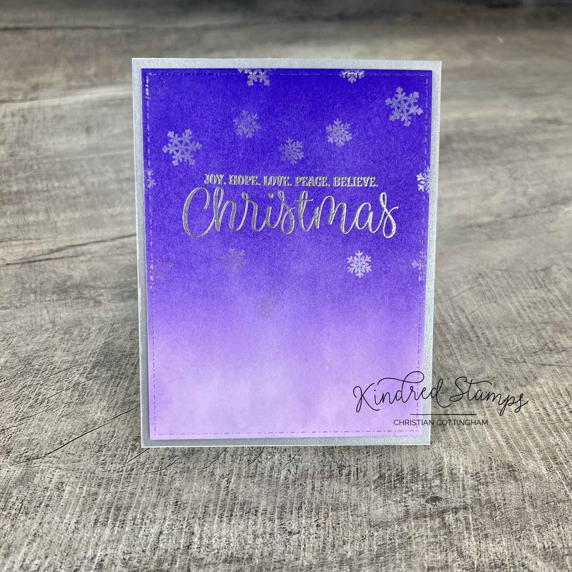
Nativity Play, Kindred Stamps
Project One: Joy. Hope. Love. Peace. Believe.
Showcasing the amazing typography in the sentiments of the Nativity Play set, this simple gradient provides a graceful Christmas card. The card base was cut with the Cards Basic Die set after the ink blending to ensure a smooth transition. This simple ink blend utilized one color, Grape Crush (Catherine Pooler) with the repeated application pulling the blending down from the top of the paper with lessoned application towards the bottom of the card front. The sentiment is the star of the show on this card and was heat embossed with silver. The panel was adhered to a matte silver card stock with some foam tape to give that fancy dimension that makes handmade cards pop. If you want to bling it up you sure can!
Card Size: A2 top folding card (5.5 inches x 4.25 inches). Easily converted to any size card.

Nativity Play, Kindred Stamps
Project Two: O Holy Night
A simple glass cloche is a perfect way to set the scene for this special family on their debut night.
The family from Nativity Play were colored with Olo Markers and fussy cut out (someday I will learn to use the expensive machine I bought to do it for me- insert eye roll). Colors will be listed at the end of this post.
The cloche was made with a simple oval die with the bottom cut off. Bringing in some blue ink with a very light hand gives the illusion of glass (Juniper Mist Catherine Pooler). While ink blending was drying, I drew a base on a piece of scrap paper and fussy cut it out. To make the illusion of a wood base, I used Altenew Artist Markers (Y932/Y762) with random lines and flicks. While laying out my little family to see where I wanted to place my sentiment, I noticed my family was floating. I mean, I know they are special and all, but they definitely needed to be grounded. I made a mask with a post-it note and ink blended some brown ink( Altenew Espresso) and then some texture with the same marker family from Altenew. Now my family had some solid ground to stand on.

Cloche base
The sentiment “O Holy Night” matched the simplicity of the cloche and serine scene. This was heat embossed in white. Every Christmas card needs some sparkle, its a law. So I added some iridescent Stickles as twinkle stars inside my cloche. The British Invasion Paper Pack had just the right amount of texture and contrast to make the cloche be front and center. This was cut to cover the entire card front.
Card Size: A2 top folding card (5.5 inches x 4.25 inches)

Nativity Play, Kindred Stamps
Project 3: The Weary World Rejoices
Nativity Play stamp set screams “ACTION” on first glance. As soon as I saw it I knew there would be a single layer card on stage! Each cast member made it to this full panel A7 card with masking to create the set design.
With the magic of masking paper, the scene was laid out and cast member were stamped in alcohol safe ink. Some simple hand sketching of a back stage line added the grounding for the cast. Utilizing the Curtain Die, I cut out one topper to provide me the swooping curtains I was looking for. Freehand drawing of swoop lines to give the toppers texture.
The cast was colored with Olo and Altenew Artist markers (colors listed below). The stage floor, backdrop and curtain toppers were colored with Altenew Artist Markers (respectively: WG05/ WG03; S; R318/ R335).
Once the panel was dry (yes alcohol markers need to dry completely- ask me how I know…) I heat embossed in white “the weary world rejoices” in front of the new family.
Card Size: A7 (5 inches by 7 inches) Landscape

Nativity Play, Kindred Stamps
Project 4: Nativity Ornaments
Nostalgia ran full force through my body when I saw the Nativity Play stamp set. The warmth I felt made me think of sitting in front of the Christmas tree with some hot chocolate (or chocolate martini… either warm your soul) and gazing at the twinkling lights and ornaments. The Nativity Play works perfectly as ornaments. By the time you are reading this, the tree will be set up in my studio, and I may or may not have a hot chocolate or chocolate martini in hand enjoying the twinkling lights and ornaments.

Nativity Play, Kindred Stamps
Each of the designs were stamped in alcohol safe ink and then colored with Olo and Altenew Artist Markers. Colors are list at the end of this blog. Then fussy cut out and foam tape applied to the back for added dimension.

Nativity Play, Kindred Stamps
Using circle dies the frame and bases were cut out for each ornament (2 bases and 4 frames for each design). One of the bases will act as the background for the design to be centered on. A little gradient ink blending with one color (Altenew Dessert Night) and then spatters of Distress Mica Spray in Frosted Fog and Distress Spritz in Peacock Feathers to give the shimmer and shine. Because you can never have enough sparkle, bring on the Stickles!

Nativity Play, Kindred Stamps
The second base was heat embossed with silver with the 3 large sentiments from the Nativity Play stamp set. The dried inky shimmery base was adhered to the clean embossed base for stability and to hide the mucky muck on the back of the colored base. The frames were stacked up and topped with holographic paper to up the reflectivity. Each design was placed in the center. Added a topper for the ornaments to hang. Now I’m set to dig out my little silver tree for my studio and enjoy a soul warming beverage and admire my twinkly lights and shiny ornaments.

Nativity Play, Kindred Stamps

Nativity Play, Kindred Stamps
Project 5: Curtain Up
Raise the curtain to show the royalty of Nativity Play stamp set. This interactive card utilizes no speciality dies. If you plan ahead you could even make this card to be sent through the mail without extra postage unlike me. I did not plan ahead. I used the images that were already colored and fussy cut out. Learn from my mistakes. Or be cool like me and hand deliver this thick card!
The images were colored with Olo and Altenew Artist Markers. Colors listed at the end of this blog.
Using nesting A2 dies, I made a frame. With the largest die of the frame, I cut one solid base, this will be the base of the stage background. With the same large die, I cut one piece of acetate with a piece of copy paper behind the acetate. This will help the die cut cleaner and then you will not loose the acetate on your table. Or am the only one?? Finally, with the inner die of the frame, I cut one piece of card stock for the pull out curtain. Why not use the piece that came out of my original frame cut? You can take that up with my dog. He’s faster then me and then thought it was a game of keep away. Again, don’t be like me, don’t drop your stuff.
Since I was die cutting, I pulled out some rich red card stock and cut out the Curtain Die. 2 right curtains, 2 left curtains, 3 curtain toppers, and finally 2 sets of tiebacks out of a matte gold card stock.
The stage background was up first. Using colored card stock in light gray and a deeper gray I glued down the stage floor and background. Trimmed with some scissors (I was done with die cutting at this point and no one is going to see it). Tada! That was the easiest assembly ever.
Next up was the ink blending station. The curtains and curtain toppers got a dusting of brown ink to deepen the shadows and give a little dimension. To prep the pull up curtain piece, I did simple ink blending on the inside frame cut out to match my curtain color. I then cut a quarter inch off each right and left side of the landscape piece.
While the pieces were drying, frame assembly began. The frame was colored in a black alcohol marker. Because I just happened to have 2 frames (thank you Oscar, said dog), I sandwiched the acetate between the two frames. I adhered one set of the curtain sides to either side of the front facing frame. I then layered the second set of curtain sides inset on the back side of the acetate. This gave the illusion of depth on the stage. Two of the curtain topper were attached to the top of the frame. The stage was coming to life.
To allow the curtain to raise up, there has to be a gap between the top curtain frame and the base. To accommodate for the space foam tape was placed on the right, left, and bottom of framed panel. Do not put foam across the top or you will not be able to pull the curtain up. Now, as we identified early on, if I would have planned ahead, I could have stamped the royalty using masking paper as a single layer for my background. I did not, so I had to adapt. I added a second layer of foam to ensure that the curtain would clear of any uneven speed bumps from the fussy cut images.
With the frame complete, I can now visually see where to place my royals. I lined up the stage base with the foam lined frames and was able to get my royals in just the right spot and glued down edge to edge (again, trying to avoid the curtain catching on the images). Once they were positioned I was able to focus on the where to put my sentiment on my curtain pullout. Using my stamping platform and a sticky mat I lined up the internal curtain and the foam lined frame. Centered my sentiment on top of the acetate. I was able to pick up the stamp from the acetate with ease and remove the frame from the stamping platform. After prepping with an antistatic tool, “Joy to the world” stamped in embossing ink and heat embossed in gold onto the curtain pullout.
The frame and the stage base assembly was next up. The foam tape holds the two layers together. Because the frame and base sizes match, it was easy to line them up. If you struggle with lining up the elements, you can use any cornered object to aid in your alignment (stamping platform/ score tool/ box lid). Place one piece in the corner snuggly and use the same corner to snug your next piece into place.
To make the curtain pullout, I used a piece of scrap paper a smidge thinner than the last curtain topper that was diecut. To make sure that the paper would not get stuck on my royals, I positioned the paper to the base of the pullout leaving a long tail that I will cut off later. With the insert in place, I used a strip of thin foam tape to act as a stopper at the top ledge of the stage and to adhere the top edge of our last topper. This allows the curtain topper to over lay the other toppers. I stamped “pull here” and trimmed the excess paper off of the curtain pullout.
The stage needs to be lit up, so I embellished the card with some pearls as my lights. I pulled out my A2 card base, and ummmmm nope. Well crud, this designing on the fly was not my friend…. A6 Card to the rescue! I layered the same deep red card stock to the card base and then centered my stage. TADA! It worked and the royals are center stage. Don’t be like me… plan ahead.
Card Base: A6 (4.5 inches by 6.25 inches) Landscape
The entire Kindred Stamps release will be available this Friday at 8am PST/11am EST. Be sure to subscribe to the Kindred Stamps blog to see a daily line up of sneak peeks from our amazing Design Team! Come join the Fan Club and release event to be part of the release fun, and you may just win some Kindred Stamps credit!!
Coloring Guide:
New Father:
Headpiece/ Robe: Olo R1.7/ R1.5
Shirt/ Socks: Olo Y2.2/Y2.3
Shoes: Olo CG0/ CG1
Skin: Olo OR4.4/ OR4.2/ OR4.2
New Mother:
Headpiece/ Dress: Olo B0.5/ B0.3
Shoes: Olo CG9/ CG7
Hair: Olo B/ CG9/ CG7
Skin: Olo OR4.4/ OR4.2/ OR4.1
Baby:
Body: Olo Y2.2/ Y2.3
Blanket: Olo BG2.3/ BG 2.1
Manger: Olo O7.7/ O7.8
Hay: Olo YO2.5/ Yo2.7
Drummer Boy:
Headpiece: Olo G1.7/ G1.5
Drum: Olo R1.5/G1.5/ YO2.0/ O7.3
Body: Olo CG1/ CG0
Ears/ Spot: Olo CG9/ CG7
Collar: Olo CG7
Shepard:
Headpiece: Olo B0.2/ BO0.3
Shirt: Olo R0.6/ R0.5
Pants: Olo CG9/ CG7
Shoes: Olo O7.7/ O7.8
Skin: Olo OR4.4/ OR4.2/ OR4.1
Staph: Olo O7.7/ O7.8
King 1:
Crown/ Container: Altenew Artist Marker C014/ C013; Olo R0.6/ R0.5
Hair: Olo YO2.5/ Y2.3/ Y2.2
Skin: Olo OR4.4/ OR4.2/ OR4.1
Gown: Olo BV2.6/ BV2.3
Sash/ Shawl: Olo CG0/ CG1
Shoes: Olo O7.7/ O7.8
King 2:
Crown: Olo WG1/ WG3/ BV4.2/ BV4.4
Robe: Olo O1.3/ O1.2
Gown: Olo BV4.5/ BV4.4
Hair: Olo CG7/CG9
Skin: Olo OR3.7/ OR3.8/ OR3.4
Shoes: Olo O1.3/ O1.2/ CG0/ CG1
Container: Altenew Artist Markers C014/ C013
King 3:
Crown/ Container: Altenew Artist Markers C014/ C013
Headpiece/ Gown: Olo YG8.3/ YG8.5/ YG8.7
Shoes: Olo WG5/ WG3
Skin: OR4.4/ OR4.2/ OR4.1
Dirt: Olo O4.6/ O4.3
Angel:
Crown: Olo WG1 or metallic ink pen
Hair: Olo YO2.5/ Y2.3/ Y2.2
Skin: Olo OR4.4/ OR4.2/ OR4.1
Dress: Olo R2.2/ R2.4
Wings: Olo CG0/ CG1
Socks: Olo R2.4
Shoes: Olo CG0 CG1
Horn: Altenew Artist Markers C014/ C013
NA NA NA NA BIRTHDAY
NA NA NA NA BIRTHDAY
This pop-up requires no speciality dies but makes an impact!
This blog does utilize affiliate links. These links do not cost you anything. If you feel inspired and want to purchase from one of my links, you are supporting me on my crafty adventures.
Let’s talk background first. To have a nice boarder to frame the card, die cut a card panel. I used the Card Basic Die from Kindred Stamps, because I don’t know about you but I can not cut a straight line no matter what the tool is. I knew I wanted a deep night scene to have my callout lay against. Utilizing Altenew Cool Summer Night ink collection in the multiple depths of blue with a little Altenew Jet Black I got the deep tone I wanted.
Doing a dive into my colored card stock scraps I found the perfect yellow. On one piece of scrap I die cut a circle frame from the Kindred Stamps Nesting Circle dies to get a circle without stitching. The bat came from Spellbinders Boo-Licious Cupcake die set. Using my circle as my guide, I got out that trusty ruler and extended lines gradually to make a cone. The cone was adhered flat to the card panel and the circle die was popped up with a little foam tape.
Now that the inky background was dry, I was able to stamp the sentiment from Kindred Stamps Bad Guys Have More Fun stamp set and emboss with Snowfall embossing powder from Kindred Stamps.
The Kindred Stamps Cityscape die was cut out once to get the base die cut on some black card stock and then a second time with the same Card Basic Die to have the stitching be continuous. With the leftover yellow scraps, I filled in the windows. The Cityscape was adhered to the card panel flat.
The Kindred Stamps Drive In Memory Dec die set provided the base for the car. The die cut was colored with Altenew Artist Markers and the license plate was colored and stamped with a bat from my stash (unknown). No car is completed without the main character and his side kick. This combo was stamped from Kindred Stamps Bad Guys Have More Fun stamp set. Colored in Altenew Artist Markers and Olo Markers. I inserted the combo into the windshield and secured them in place.
Finally, here is where the pop-up mechanism comes in to play! To make my combo pop from the scene I utilized a piece of black card stock with accordion folds on either side to pop the car off the page. To measure for the mechanism, I measured the length of my final die cut and deducted a 0.25 inches. I also validated the height of the die cut to ensure the card stock would not show through the windshield. Prior to cutting my piece of paper I added 1.5 inches to each side of my desired length. This allowed me to score at 0.5 inches, 1 inch, and 1.5 inches on both sides of the strip. I accordion folded the ends. Once I had my strip adhered to the car die cut, I was able to adhere the lower tabs of the accordion mechanism to the base. Now my car pops off the page but folds flat to mail. The card panel was attached to an A2 top folding card base.
Final Dimensions: 5.5 x 4.25 inches
Marker Colors:
Car: Altenew TG07/ TG05/ TG03/ TG02/ Y205
Main Guy: Altenew TG07/ TG05/TG03/TG02 Olo OR4.4/ OR4.1/OR4.2/OR1.0
Sidekick: Olo OR4.4/ OR4.1/OR4.2/OR1.0 Altenew Y762/Y932/ Y204/ C004/ R056/ Y932/ G935/G825/R318/R335